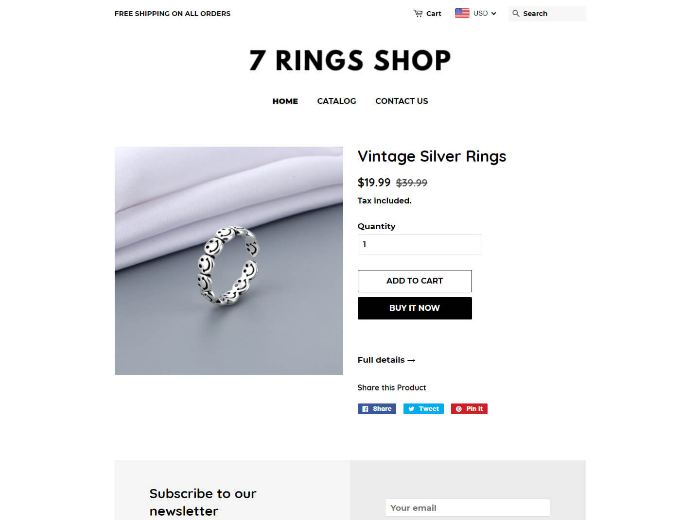
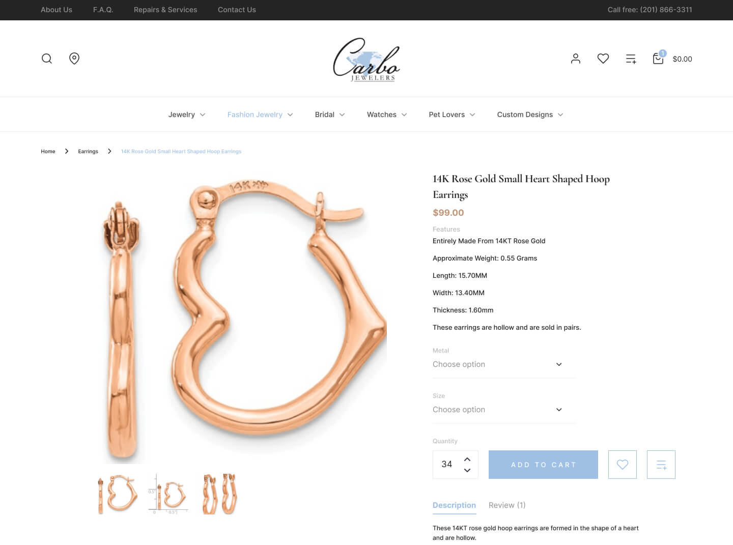
For scaling ecommerce businesses, your website isn’t just a digital storefront—it’s your primary revenue engine. Creating a compelling ecommerce website that reflects your branding and engages customers is essential for building a strong online presence. Yet according to the Telstra Small Intelligence Report, 62% of customers won’t consider a brand without a strong online presence, and it takes just 0.05 seconds for visitors to form their first impression of your business.
As CMOs, Marketing VPs, and ecommerce leaders at growth-stage companies know, maintaining a high-performing website requires continuous optimization across design, user experience, conversion rate optimization, and technical infrastructure. The challenge? Traditional agency models with lengthy project timelines and unpredictable costs make it difficult to iterate at the speed modern ecommerce demands.
This is where a strategic approach to website design becomes critical. Your site must simultaneously serve as a brand ambassador, conversion machine, and data collection platform—all while adapting to evolving customer expectations and competitive pressures. Strong branding is essential for building trust, differentiating your business, and fostering customer loyalty in a crowded market.
Selecting the best ecommerce website builder is crucial to ensure your site has the features, customization options, and scalability needed for growth. In this article, we’ll examine six strategic reasons why ecommerce website design should be a continuous investment priority, not a one-time project. We’ll explore how leading B2B and B2C brands approach design as an ongoing optimization discipline, and how modern subscription-based models enable the rapid iteration necessary for competitive advantage.
The Modern Approach to Ecommerce Design
Traditional ecommerce design operates on a project basis: you hire an agency, wait weeks for proposals, invest months in development, and launch a site that immediately begins aging. By the time you identify needed improvements, you’re back to square one—requesting quotes, managing procurement, and waiting for availability.
Leading ecommerce organizations are shifting to a different model: continuous design and optimization through dedicated resources. Rather than episodic redesigns, this approach treats your website as a living system that evolves based on user data, business goals, and market conditions.
This operational shift offers several advantages for scaling businesses:
- Predictable costs: Fixed monthly investment replacing variable project quotes
- Rapid iteration: 1-3 day turnaround on design requests vs. weeks with traditional agencies
- 360° expertise: Access to senior specialists across design, development, UX research, CRO, and AI automation
- Scalable resources: Ability to instantly scale capacity during high-priority initiatives
- Integrated approach: Seamless coordination across ecommerce platforms such as Shopify, WordPress, Webflow, and custom platforms
For marketing leaders managing ambitious growth targets with constrained resources, this model eliminates the bottleneck of traditional agency relationships while maintaining enterprise-grade quality standards.
1. First Impression and Credibility
Your website sets the first impression of your company once your potential customers visit it. As mentioned above, it takes your audience a few milliseconds to judge your website and decide if they want to stay. That’s why your web design must immediately communicate credibility, professionalism, and value.
Thus, remember that an outdated web design will set a negative first impression about your online retail store. They will immediately leave your page and look for a similar service or product in your competitive landscape. This represents significant revenue loss, and research demonstrates that customer reacquisition costs 5-25x more than retention. Studies have shown that 66% of online surfers would prefer to see something well-designed than something that screams “we didn’t put enough effort.” A carefully chosen color palette can instantly enhance first impressions and reinforce your brand’s identity, making your site more visually appealing and memorable.
Furthermore, about 75% of your potential customers judge your brand’s credibility based on the design of your website. A poorly designed website may make your consumers doubt your credibility and professionalism. For instance, if you wanted to buy a used mobile phone, which website would you trust more? The credibility differential becomes immediately apparent.
Therefore, prioritizing your website design is incredibly important since it shapes the way your potential customers perceive your company. Your website design may either push your visitors away or help you keep your leads on your page. I am pretty sure that the latter is your preferred direction.
2. Search Engine Optimization
Search engines account for 93% of all online traffic, making organic visibility a critical competitive advantage. However, SEO isn’t a one-time technical checklist—it’s an ongoing discipline that requires coordination between design, content, and technical implementation.
According to McKinsey research, companies that shift investment from general advertising to quality web content see up to 21% increases in ecommerce sales. This underscores a fundamental truth: your website’s design directly impacts its ability to rank, attract, and convert organic traffic. In the e commerce landscape, effective design and optimization are essential for online retail success.
Strategic SEO Considerations for Ecommerce Design:
Site Architecture & Navigation
- Implement logical category hierarchies that mirror customer search intent
- Ensure all products are accessible within 3 clicks from the homepage
- Create SEO-friendly URL structures that include relevant keywords
- Build internal linking strategies that distribute page authority effectively
Technical Performance
- Optimize Core Web Vitals (LCP, FID, CLS) as Google ranking factors
- Implement structured data markup for rich search results
- Ensure mobile-first indexing compatibility across all pages
- Maintain fast load times without sacrificing visual quality
Content Integration
- Design product pages that accommodate comprehensive, keyword-rich descriptions
- Create blog infrastructure for thought leadership and long-tail keyword targeting
- Implement faceted navigation that doesn’t create duplicate content issues
- Build landing page templates optimized for conversion and SEO simultaneously
Platform-Specific Optimization Different platforms require tailored approaches:
- Shopify: Leverage apps and theme customization for SEO while maintaining performance
- WordPress/WooCommerce: Utilize plugins strategically without bloating site speed
- Webflow: Take advantage of clean code and built-in SEO controls
- Custom platforms: Implement technical SEO best practices from the ground up
Choosing the right platform for your e commerce website is crucial, as it impacts scalability, SEO capabilities, and integration with essential tools.
The Continuous Optimization Advantage
Traditional agencies deliver SEO as a project deliverable. Modern approaches integrate SEO into ongoing optimization cycles, using tools like Crolytics.ai to identify opportunities, test hypotheses, and measure impact continuously. This allows you to:
- Respond quickly to algorithm updates
- Test and iterate on-page optimization strategies
- Expand content based on emerging keyword opportunities
- Monitor and improve technical performance metrics
For marketing leaders, this means SEO becomes a predictable growth channel rather than a periodic investment with uncertain returns.
To further enhance your strategy, find examples of SEO-optimized ecommerce websites to inspire your own site architecture and design decisions.
3. Usability and Customer Journey
It is vital to make sure that your visitors can find what they are looking for as smoothly as possible. In fact, the design of your website plays an immense role in terms of usability. Studies have shown that about 86% of your audience would love to find information about your products and services right on your website. Moreover, 65% of them would love to learn how to contact you, and having an “About Us” page would make 52% of your visitors happier.
To achieve this, it is essential to follow established UX practices and best UX practices when designing your ecommerce website. These practices ensure your site is intuitive, user-friendly, and optimized for a seamless user experience.
Thus, you should pepper your website with on-point design elements which give your potential customers the experience they want. Otherwise, you will make your users unhappy and push them away from your store. The result? They navigate to competitors. This scenario represents direct revenue loss and competitive disadvantage.
How to Optimize Your Website’s Usability
To avoid this, you can use standard conventions, such as placing your primary sections in your main navigation or home page and having a help/contact us button on the upper-right corner of your website. Additionally, test and optimize the transactional flow to ensure customers can move smoothly from browsing to checkout, which helps prevent cart abandonment and improves conversion rates. See the online shopping website example below:
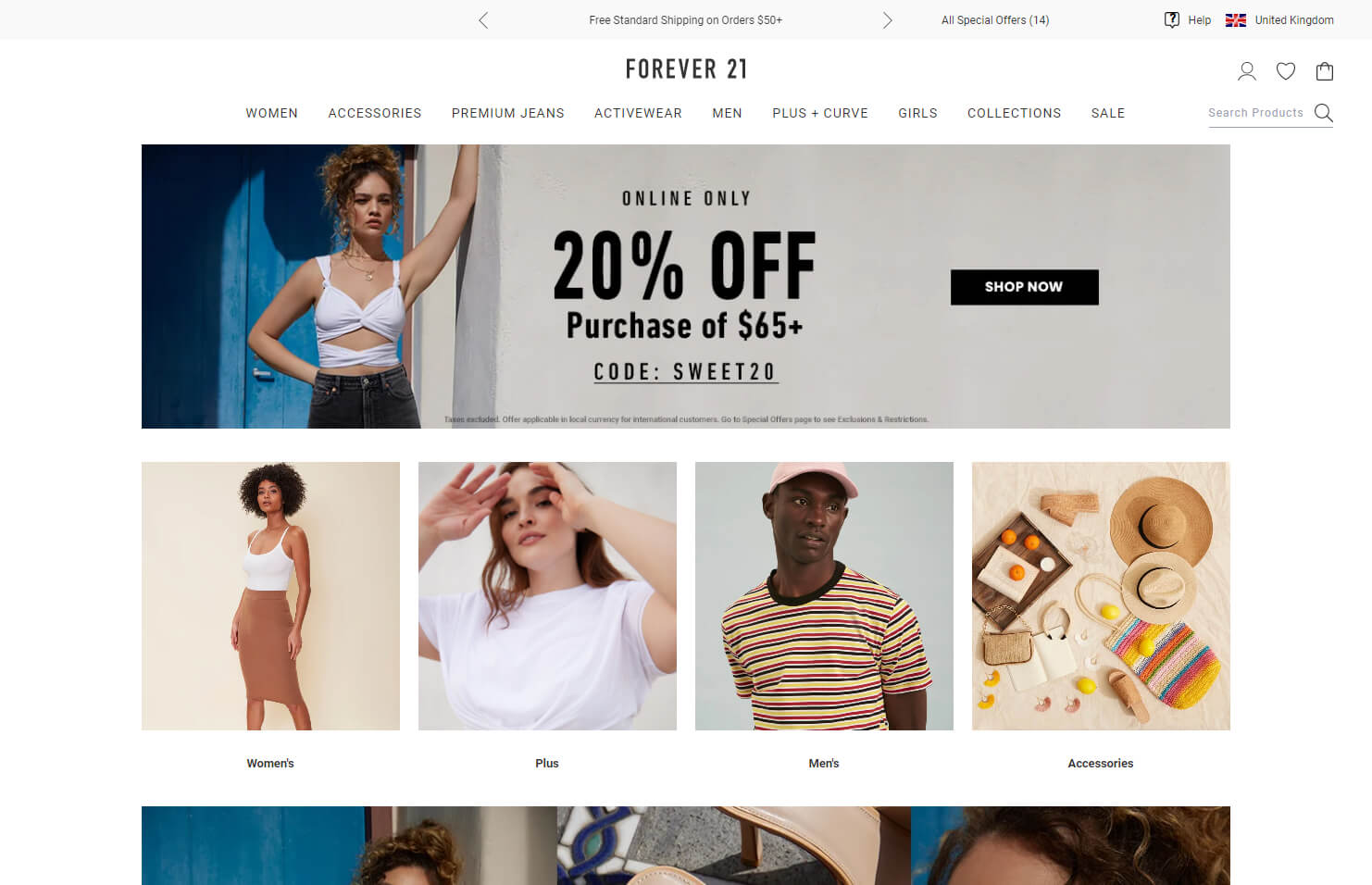
Just keep in mind that your website can work perfectly, but a lousy web design may make your visitors think that it’s hard to use. Think of a situation when you view two pages selling the same product. Both of them operate flawlessly; however, the second of them has a more attractive design. You wouldn’t even try to surf the former to find out that it works perfectly. The mere representation would leave you with the idea that the unattractive one is also weak in terms of its usability.
Therefore, a good web design not only affects the usability of your site in a practical manner but also people’s first perception of its usability. So, a good web design gives your potential customers a good user experience and affects their expectations on how that experience will look like if they decide to spend more time on your page.
4. Navigation
The navigation of your website is one of the prominent web design elements. Most ecommerce web designers apply Hick’s Law to topple the psychology of their users.
In short, Hick’s Law states that people take longer to make a decision once they have many choices. The longer they take to decide, the higher is the probability that they will end up buying nothing. This principle—known as Hick’s Law—dictates that navigation should minimize cognitive load through strategic simplification.
Thus, you should make sure that your visitors can easily decide where to go. This can be done by keeping the choices fast and simple. Organizing your navigation by clear product categories helps users quickly find what they need and improves their browsing experience. So when we apply Hick’s Law to website navigation, we want to keep the choices as simple as possible to make it easier for users to decide where to go. Try to limit the number of choices/options up to seven.
To make it more vivid, take a look at the example below. On the main navigation of Apple’s website, you can find 7 primary sections, one of which is the “Support” button. After clicking, for instance, on “iPhone”, you can choose whether you want to view a specific model or other product-related accessories (see the second picture). Effective navigation ensures users can quickly reach the desired product page, which enhances their overall shopping experience.
5. Conversion-Centered Design Maximizes Revenue Per Visitor
Every design decision either facilitates or hinders conversion. While aesthetic appeal matters, conversion rate optimization (CRO) requires a data-driven approach that continuously tests hypotheses and implements winning variations.
Leading ecommerce organizations don’t guess at what converts—they build experimentation frameworks that systematically improve performance across the customer journey.
Strategic CRO Through Design
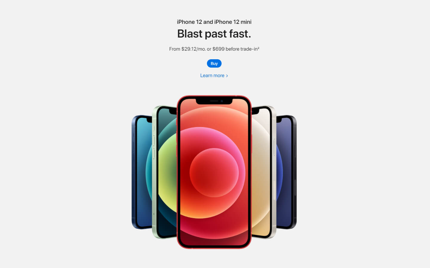
Visual Hierarchy & Attention Management Effective design guides user attention to high-value actions. Consider how Apple uses white space around CTAs to create visual focus:
This approach isn’t just aesthetic—it’s strategic attention management. By isolating the product and CTAs with white space, Apple reduces cognitive load and increases the probability of desired actions. High-quality product imagery also plays a crucial role in drawing attention, showcasing product details, and increasing conversions.
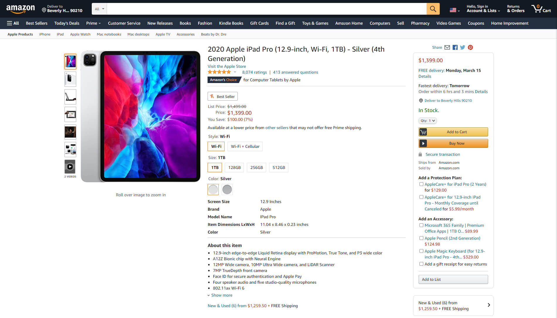
However, minimalism isn’t the only effective approach. Amazon’s product pages demonstrate that information density can drive conversion when organized strategically:
Despite visual complexity, the “Add to Cart” and “Buy Now” buttons remain unmissable through color contrast, size, and positioning. The key isn’t minimalism vs. density—it’s intentional design that serves conversion goals. Clear and engaging product photos help build trust and drive purchase decisions by effectively communicating product quality and use.
Conversion Optimization Methodology
Sustainable conversion improvement requires systematic experimentation:
1. Qualitative Research
- User session recordings to identify friction points
- Heatmap analysis to understand attention patterns
- User interviews to uncover objections and concerns
- Usability testing to validate design hypotheses
2. Quantitative Analysis
- Funnel analysis to identify drop-off points
- Cohort analysis to understand segment-specific behavior
- Analytics review to prioritize high-impact opportunities
- Statistical significance testing for experiment validity
3. Hypothesis Development
- Translate research insights into testable hypotheses
- Prioritize based on potential impact and implementation effort
- Design variations that isolate specific variables
- Establish success metrics and measurement frameworks
4. A/B Testing & Implementation
- Run controlled experiments on high-traffic pages
- Test multiple variations simultaneously with multivariate testing
- Implement winning variations across relevant pages
- Document learnings to inform future optimization
Well-designed pop ups can also be used to deliver personalized offers based on user behavior, helping to reduce cart abandonment and further optimize conversions, see these 8 tips to transform your website’s user experience.
Platform-Specific CRO Considerations
Different platforms offer varying CRO capabilities:
- Shopify: Native A/B testing limitations require third-party tools or custom development
- WordPress: Extensive plugin ecosystem for testing and optimization
- Webflow: Clean code enables sophisticated custom testing implementations
- Custom platforms: Full control over experimentation infrastructure
The Continuous Optimization Advantage
Traditional agencies deliver conversion optimization as a project: conduct research, implement changes, measure results, and disengage. This approach misses the compounding value of continuous experimentation.
Modern CRO operates as an ongoing discipline using platforms like Crolytics.ai to:
- Continuously monitor conversion funnel performance
- Automatically identify optimization opportunities
- Prioritize experiments based on predicted impact
- Track cumulative conversion improvements over time
For marketing leaders managing revenue targets, this approach transforms CRO from a periodic initiative into a predictable growth driver. Rather than hoping a redesign improves conversion, you build systematic improvement into your operations.
Integration with Broader Marketing Strategy
Effective CRO doesn’t exist in isolation—it integrates with:
- Paid acquisition: Ensuring landing pages match ad messaging and intent
- Email marketing: Optimizing post-click experiences for campaign traffic
- Content marketing: Designing conversion paths for organic visitors
- Customer retention: Improving post-purchase experiences to drive repeat sales
This integrated approach requires coordination across design, development, analytics, and marketing—precisely the 360° capability that separates high-performing ecommerce operations from those struggling to scale.
6. Mobile-First Design Captures Majority Revenue
According to Statista, mobile devices generated 49.2% of US retail ecommerce sales in 2020, with projections reaching 53.9% in 2021. This trend continues accelerating, making mobile experience not just important—but primary.
Yet Google research reveals that 53% of mobile users abandon sites that take longer than 3 seconds to load, and 85% of adults expect mobile experiences to be equal to or better than desktop. For ecommerce leaders, this creates a clear mandate: mobile performance directly impacts revenue. Integrating secure and mobile-optimized payment gateways is essential to ensure a seamless checkout experience for customers using mobile devices.
Ecommerce Site Security and Performance
Today, security and performance are the backbone of any successful online store. For ecommerce businesses, these aren’t just technical checkboxes—they’re essential to building trust, protecting your brand’s reputation, and ensuring a seamless customer journey that drives sales and loyalty.
Security: The Foundation of Customer Trust
Online shoppers are more discerning than ever, and their willingness to complete a purchase hinges on how safe they feel sharing their personal and payment information. A great ecommerce website must demonstrate a brand’s commitment to security at every touchpoint. This starts with implementing SSL certificates to encrypt data, deploying firewalls to block malicious traffic, and keeping all software and plugins up to date to prevent vulnerabilities.
Displaying trust indicators—such as security badges, payment gateway logos (like Amazon Pay and PayPal), and clear privacy policies—signals to potential customers that your ecommerce site is a safe place to shop. These trust signals are especially important on product pages and during checkout, where hesitation can lead to shopping cart abandonment. For small businesses and established brands alike, investing in robust security measures is a non-negotiable part of ecommerce website design.
Performance: The Key to a Frictionless Customer Experience
Website performance is just as critical as security. Slow load times, laggy product galleries, or unresponsive design can frustrate online shoppers and send them straight to your competitors. Optimizing your ecommerce website for speed means compressing high quality images, leveraging browser caching, and using content delivery networks (CDNs) to serve assets quickly across different devices and screen sizes.
A high-performing ecommerce site not only improves the customer experience but also boosts your SEO rankings, as search engines prioritize fast, user-friendly ecommerce websites. This is especially important as more customers shop on mobile devices, where every second counts.
Building Trust and Reducing Friction
Beyond technical measures, the best ecommerce websites use design to reinforce trust and streamline the path to purchase. Prominent customer reviews, social proof, and press mentions on product pages help reassure new customers and reduce hesitation. Offering multiple payment options—including credit cards, digital wallets, and third-party gateways—caters to diverse preferences and minimizes checkout friction.
Design Examples and Platform Considerations
Leading online stores like Patagonia and REI set the standard for integrating security and performance into their ecommerce website design. Their sites feature intuitive navigation, high quality product images, and clear calls-to-action, all while maintaining fast load times and visible trust indicators. In the self-care and beauty space, brands like Meow Meow Tweet and Flaus use unique fonts, fully customizable layouts, and inspirational design to create memorable, secure, and high-performing ecommerce experiences.
Choosing the right ecommerce platform is also crucial. Solutions like Shopify, BigCommerce, and WooCommerce offer robust security features, reliable free hosting, and a wide range of design templates and third-party apps to help you create a great ecommerce website design without advanced coding skills. The best ecommerce website design builders make it easy to implement best UX practices, optimize for performance, and scale as your business grows.
Continuous Optimization for Lasting Success
Ultimately, prioritizing security and performance in your ecommerce website design is not a one-time task—it’s an ongoing commitment. As technology evolves and customer expectations rise, continuous investment in these key elements ensures your ecommerce business remains competitive, trustworthy, and ready to convert every visitor into a loyal customer. By focusing on security, performance, and a user-friendly design, you lay the groundwork for a great ecommerce website design that stands out in a crowded market and delivers exceptional results.
Strategic Mobile Optimization
Mobile-First Design Methodology Rather than adapting desktop designs for mobile, leading organizations design for mobile first, then enhance for larger screens. This approach ensures:
- Core functionality works on constrained devices
- Touch targets meet minimum size requirements (44×44 pixels)
- Navigation accommodates thumb-based interaction patterns
- Forms minimize input requirements and leverage mobile keyboards
- Checkout flows reduce friction for small-screen completion
Performance Optimization Mobile users operate on variable network conditions and device capabilities. Performance optimization must address:
- Image optimization: Responsive images serving appropriate sizes per device
- Code efficiency: Minimized JavaScript and CSS to reduce processing demands
- Lazy loading: Deferring off-screen content to improve initial load times
- CDN implementation: Serving assets from geographically distributed servers
- Caching strategies: Reducing server requests for returning visitors
Platform-Specific Mobile Considerations
Different platforms offer varying mobile optimization capabilities: Ecommerce sites, including those selling physical products, digital products, or using dropshipping and print-on-demand models, benefit from these platform-specific features.
- Shopify: Mobile-optimized themes with built-in responsive design, though customization may require developer expertise
- WordPress/WooCommerce: Extensive mobile plugin ecosystem, but performance requires careful theme selection and optimization
- Webflow: Clean, responsive code by default with granular mobile design controls
- Custom platforms: Full control over mobile experience but requires dedicated mobile expertise
Mobile Conversion Optimization
Mobile users exhibit different behavior patterns than desktop users:
- Shorter attention spans requiring faster value communication
- Higher sensitivity to friction in forms and checkout
- Greater reliance on visual information over text
- Increased use of features like click-to-call and maps integration
Optimizing for mobile conversion is essential for businesses looking to sell online and reach customers wherever they are.
Effective mobile CRO addresses these patterns through:
- Simplified navigation: Hamburger menus or bottom navigation bars
- Prominent CTAs: Sticky buttons that remain accessible while scrolling
- Streamlined checkout: Guest checkout, autofill, and digital wallet integration
- Trust signals: Mobile-optimized security badges and social proof
- Progressive disclosure: Revealing information progressively to avoid overwhelming small screens
Testing Across Devices
Browser emulators provide initial testing, but real-device testing reveals issues emulators miss:
- Actual touch interaction patterns
- True performance on various network conditions
- Device-specific rendering issues
- Operating system-specific behaviors
Leading ecommerce operations maintain device labs or use cloud-based testing services to validate experiences across:
- iOS (iPhone, iPad) across multiple versions
- Android devices from various manufacturers
- Different screen sizes and resolutions
- Various network conditions (4G, 5G, WiFi)
Strategic Implications for Ecommerce Leaders
Your ecommerce website design represents the intersection of brand, user experience, technology, and revenue generation. As we’ve explored, effective website design extends far beyond aesthetics—it encompasses SEO architecture, conversion optimization, mobile performance, usability, and continuous iteration. A brand’s commitment to continuous improvement is reflected in ongoing website optimization, demonstrating dedication to quality, innovation, and customer experience.
For CMOs, Marketing VPs, and ecommerce leaders at scaling organizations, this creates a strategic challenge: how do you maintain the velocity of optimization required for competitive advantage while managing resource constraints and maintaining quality standards?
The Traditional Approach Falls Short
Traditional agency relationships create inherent limitations:
- Project-based engagement: Long procurement cycles and fixed scopes limit agility
- Variable costs: Unpredictable quotes make budgeting difficult
- Specialized silos: Design agencies don’t do CRO; CRO agencies don’t do development
- Slow iteration: Weeks or months between identifying opportunities and implementing solutions
- Knowledge loss: Agencies disengage after projects, taking institutional knowledge with them
These limitations force marketing leaders into a difficult choice: build expensive in-house teams (2-5x the cost of alternatives) or accept slow, fragmented optimization through traditional agencies. If your current approach creates bottlenecks in any of these areas, it may be time to explore modern alternatives. Leading organizations have created agile processes and intentionally developed high-performing ecommerce websites to ensure they remain competitive and effective.
The Modern Alternative: Subscription-Based Optimization
Leading ecommerce organizations are adopting a different model: unlimited design, development, and optimization through dedicated subscription resources. This approach provides:
Predictable Investment
- Fixed monthly costs ($5,000-$12,500 per resource) replacing variable project quotes
- No hidden fees, procurement delays, or scope creep
- Scalable capacity through stacking multiple resources for high-priority initiatives
Rapid Execution
- 1-3 day turnaround on most requests vs. weeks with traditional agencies
- Unlimited requests processed sequentially by dedicated senior specialists
- Immediate scaling when business priorities shift
Comprehensive Expertise
- Grow tier: Senior designers, motion graphics artists, and developers (Shopify, WordPress, Webflow)
- Optimize tier: Adds UX researchers, CRO specialists, and analytics experts
- Innovate tier: Adds AI engineers for automation and personalization
Enterprise Quality
- Top 0.5% of talent with 5+ years experience
- Dedicated project management and seamless Slack integration
- ISO 27001-ready security and compliance standards
- Full ownership of all deliverables
Integrated Approach Rather than coordinating multiple vendors, you access 360° capabilities through a single relationship—enabling the cross-functional collaboration that effective optimization requires.
Practical Application
Consider a typical scenario: Your analytics reveal mobile checkout abandonment at 68%, significantly above industry benchmarks. With traditional agencies, you would:
- Request proposals from UX research firms (2-3 weeks)
- Conduct research project (3-4 weeks)
- Request proposals from design agencies (2-3 weeks)
- Design and develop improvements (4-6 weeks)
- Request proposals from CRO agencies for testing (2-3 weeks)
- Run A/B tests and implement winners (4-6 weeks)
Total timeline: 17-25 weeks. Total cost: $50,000-$150,000.
With a subscription approach:
- Request mobile checkout research (delivered in 2-3 days)
- Request design improvements based on findings (delivered in 2-3 days)
- Request development implementation (delivered in 3-5 days)
- Request A/B test setup and monitoring (ongoing)
Total timeline: 2-3 weeks. Total cost: $10,000-$12,500 (one month subscription).
The difference isn’t just speed and cost—it’s the ability to continuously optimize rather than treating improvement as an episodic project. This ongoing process ensures your ecommerce store remains professional, user-friendly, and ahead of customer expectations and market trends.
Taking Action
For marketing leaders evaluating their ecommerce optimization approach, consider:
- Current state assessment: How quickly can you move from identifying opportunities to implementing solutions?
- Resource evaluation: Are you getting 360° coverage or managing multiple specialized vendors?
- Cost analysis: What are you actually spending on design, development, CRO, and optimization across all vendors?
- Quality review: Are you consistently receiving enterprise-grade deliverables with predictable turnaround?
- Scalability test: Can you instantly scale capacity when priorities shift or opportunities emerge?
If your current approach creates bottlenecks in any of these areas, it may be time to explore modern alternatives.
Next Steps
Passionates offers progressive subscription tiers (Grow, Optimize, Innovate) providing unlimited access to senior specialists across design, development, UX research, CRO, and AI automation. With 1-3 day turnaround times, predictable costs, and enterprise-grade quality, we enable the continuous optimization that scaling ecommerce businesses require.
Book a consultation to discuss your specific needs and priorities or explore detailed service information at passionates.com
