When it comes to showcasing your business online, responsive web design is no longer optional—it’s essential. With over 60% of web traffic now coming from mobile devices, a website that doesn’t adapt seamlessly across all screens is actively losing you customers and revenue. Responsive web design ensures accessibility and usability for different users on various devices, including smartphones, tablets, and desktops. To achieve this, it’s crucial to follow best practices in responsive web design, ensuring usability for all users by considering content, design, and performance across every device.
But here’s what most businesses get wrong: they treat responsive web design as a one-time technical checkbox rather than an ongoing strategic advantage. The reality? Your website’s ability to deliver exceptional experiences and ensure usability across every device—by adapting to the needs of different users and various devices—directly impacts your conversion rates, search rankings, and bottom line.
In fact, research shows that responsive design can increase mobile conversion rates by up to 160%, while 53% of mobile users abandon sites that take over 3 seconds to load. For businesses serious about growth, choosing the right responsive web design partner isn’t just about aesthetics—it’s about measurable business outcomes.
In this guide, we’re taking a comprehensive look at responsive web design:
- What it really means (beyond just “mobile-friendly”)
- How it works to drive conversions, not just traffic
- How to identify the best responsive web design companies in the UK market
- What modern businesses should demand from their web design partner
But first, let’s establish exactly what responsive web design is and why your choice of partner matters more than you think.
How to Choose a Responsive Web Design Company in the UK
What is Responsive Web Design?
Responsive web design is the art of creating a website that adapts and adjusts itself according to the device that the user is visiting the website from, including various device types such as smartphones, tablets, and desktops. If a user clicks through to your website on their smartphone, your website should instantly know which device they are visiting from and adjust the experience accordingly. Crucially, this should be the case whether their journey starts from social media, a marketing email, or a quick google search.
Responsive design ensures that every user benefits from the very best user experience by adapting both big and small details. Regardless of the device they are using, a responsive design makes navigation super easy to follow and gives your website the flexibility to change elements of the design to fit the screen seamlessly. Elements automatically resize to fit different screen resolutions and device types, ensuring optimal display and usability. Responsive web design addresses various screen sizes, so your site looks and works great on any device. To achieve this, designers often use multiple breakpoints, which are specific thresholds for screen sizes, to ensure smooth transitions and optimal layouts across a wide range of devices.
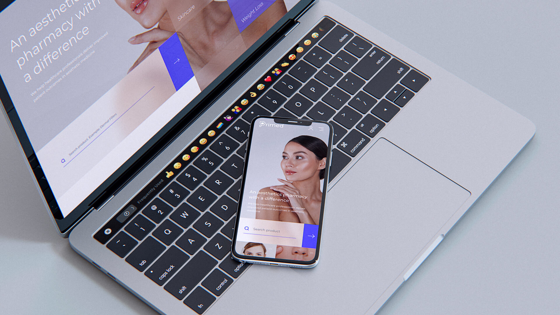
What does a Responsive Website actually look like?
The challenge that many businesses face when it comes to building a responsive website is the amount of tailoring required to get their website in the best possible shape across all devices, whether it’s a desktop version, mobile version, or any particular device. That’s where a responsive web design company comes in. Channelling skills in both web design and in connecting that design with the requirements of different devices, a professional web design company takes your vision and will transform it into a website that ticks the following boxes:
- It makes the best possible use of the screen space available. For example, it will ensure that the font becomes smaller on a smartphone screen. Meanwhile, the desktop version typically offers a more comprehensive and feature-rich experience, giving the user more blank space to digest the content, while the mobile version may present a simplified layout for easier navigation on smaller screens.
- It fixes orientation across each device so that images never overlap with text and vice versa.
- It considers the movement of the screen across all devices, removing unnecessary instructions; for example, telling a smartphone user that they need to scroll. After all, they’ll be doing that anyway!
- It focuses on all the elements of user experience that are working away behind the scenes, for example, the page load time.+. These features are integral in ranking highly on Google, as per the 2020 release of Google’s Core Web Vitals.
- Navigation is never affected. If anything, it becomes even easier to follow the intended journey across each device.
So, that’s what your end goal looks like. But what should you be looking for in your ideal web design company?
When tailoring for all devices, it’s important to understand the difference between mobile friendly design, mobile versions, and responsive web design. While mobile friendly design ensures usability on mobile devices and mobile versions offer a static, simplified interface for a particular device, responsive web design adapts dynamically to any screen size, eliminating the need for separate designs for each device type.
How to Choose the Right Responsive Web Design Company: Strategic Selection Criteria
From increasing your website conversion to creating a seamless customer journey across your different business touchpoints, experience is key. But in 2025, the bar for “experience” has risen dramatically. The best responsive web design companies don’t just build websites—they build conversion engines optimized for continuous improvement.
Here’s what to look for when evaluating responsive web design partners:
1. Multi-Disciplinary Capabilities, Not Just Design
The days of hiring separate agencies for design, development, UX research, and conversion optimization are over. Look for integrated teams that offer:
- Responsive web design and development
- UX research and user testing
- Conversion rate optimization (CRO)
- A/B testing and analytics
- Ongoing optimization and iteration
Why this matters: Siloed specialists create coordination overhead, inconsistent experiences, and slower delivery. Integrated teams ensure your responsive design is optimized for conversions from day one.
2. Proven Senior Expertise (5+ Years Minimum)
Junior teams learn on your dime. Senior professionals (with at least five years of specialized experience) have already encountered—and solved—the challenges your project will face.
What to verify:
- Team composition and experience levels
- Portfolio demonstrating responsive design across industries
- Case studies showing measurable business outcomes (not just design awards)
3. Rapid Delivery and Iteration Capabilities
In fast-moving markets, speed is a competitive advantage. Traditional agencies taking 2-3 weeks for simple revisions create bottlenecks that slow your entire marketing operation.
Best-in-class standard: 1-3 working days for most requests, with the ability to scale resources when you need faster turnaround.
Red flag: Agencies that can’t provide clear timelines or have a history of missed deadlines.
4. Flexible, Scalable Engagement Models
Traditional fixed-scope projects often lead to scope creep, budget overruns, and lengthy re-contracting when you need additional capabilities.
Modern alternatives to consider:
- Subscription-based models: Unlimited requests with predictable monthly costs
- Retainer arrangements: Dedicated resources with flexible allocation
- Hybrid models: Combining project-based launches with ongoing optimization
Why this matters: Your needs will evolve. Ensure you can easily scale resources up or down and add capabilities (CRO, AI, automation) without starting from scratch.
5. Post-Launch Optimization as Standard, Not Optional
Responsive design is the starting point, not the finish line. Your website’s performance will degrade over time without continuous testing, analytics review, and iterative improvements.
What to demand:
- Clear processes for A/B testing and conversion optimization
- Regular analytics reviews and data-driven recommendations
- Ongoing performance monitoring and optimization
- Integration with your existing analytics and marketing tools
6. Time Zone Alignment and Communication Infrastructure
While some businesses fixate on physical location, what actually matters is timezone alignment and communication quality. A remote-first agency operating in your timezone (UK or US Eastern) with robust communication infrastructure often delivers superior results to a local agency with limited availability.
What matters more than physical proximity: Consider the advantages of white label web design for scalable, high-quality creative solutions regardless of your team’s location.
- Timezone overlap for real-time collaboration
- Dedicated project management and single point of contact
- Integrated communication tools (Slack, Teams, etc.)
- Clear processes for requests, revisions, and feedback
Note: For truly local businesses targeting specific geographic markets, local market knowledge can be valuable—but for most B2B, SaaS, and e-commerce businesses, expertise and execution quality matter far more than physical location.
7. Integration with Your Existing Tech Stack
Your website doesn’t exist in isolation. It must integrate seamlessly with your CRM, marketing automation, analytics platforms, and e-commerce systems. If you’re interested in offering these solutions to clients, consider exploring how to become a successful white label web design reseller.
Verify agency experience with:
- Your specific platforms (HubSpot, Salesforce, Shopify, WordPress, Webflow, etc.)
- API integrations and custom development capabilities
- Marketing automation and email platform connections
- Analytics and testing tool implementation
8. Transparent, Predictable Pricing
Hidden costs and surprise invoices destroy trust and blow budgets.
What to clarify upfront:
- All-inclusive pricing covering design, development, testing, and initial optimization
- What’s included vs. what costs extra
- Cancellation terms and penalties (or lack thereof)
- Ownership of all deliverables and source files
- Licensing costs for any third-party tools or platforms
Best practice: Look for agencies offering fixed monthly pricing with no hidden fees and no cancellation penalties.
9. Business Outcome Focus, Not Just Aesthetics
Beautiful design that doesn’t convert is expensive art, not effective marketing.
How top agencies demonstrate results:
- Case studies with measurable business impact (conversion rates, revenue, engagement)
- Clear success metrics defined before starting
- Regular reporting on performance against goals
- Data-driven design decisions backed by user research and testing
Red flag: Portfolios showcasing only visual design without business context or results.
10. Comprehensive Testing Infrastructure
“It looks good on my screen” isn’t good enough. Demand systematic testing across devices, browsers, and user scenarios.
What to verify:
- Testing protocols and tools used, including the use of a JavaScript library (such as css3-mediaqueries.js) to enhance browser compatibility for responsive features
- Coverage across devices (smartphones, tablets, desktops)
- Browser compatibility testing
- Performance and load time optimization
- Accessibility compliance (WCAG standards)
Traditional Agency vs. Subscription-Based Responsive Web Design
As you evaluate responsive web design companies, it’s worth understanding the fundamental difference between traditional project-based agencies and modern subscription-based models. Traditionally, agencies often maintained several versions of a website for different devices, which was inefficient and costly compared to today’s single responsive design approach that adapts seamlessly to all screen sizes.
| Factor | Traditional Agency | Subscription-Based Model |
|---|---|---|
| Pricing | Variable project quotes (typically $20,000-$70,000+) | Fixed monthly rate ($5,000-$12,500) |
| Scope Changes | Change orders, additional fees & project delays | Unlimited requests included in monthly fee |
| Delivery Speed | 2-4 weeks typical turnaround | 1-3 days for most requests |
| Ongoing Optimization | Separate contract and budget required | Included as standard service |
| Resource Scaling | Lengthy re-contracting and negotiation | Instant scaling up/down by adding/removing packages |
| Commitment Period | Long-term project lock-in (3-6+ months) | Cancel anytime, no penalties or lock-in |
| Additional Services | Separate vendors needed (CRO, UX, development) | Multi-disciplinary access (design, dev, CRO, UX, AI) |
When traditional agencies make sense: Large, complex one-time projects with fixed requirements and extended timelines.
When subscription models excel: Ongoing optimization, rapid iteration, multi-disciplinary needs, and businesses requiring flexibility and speed.
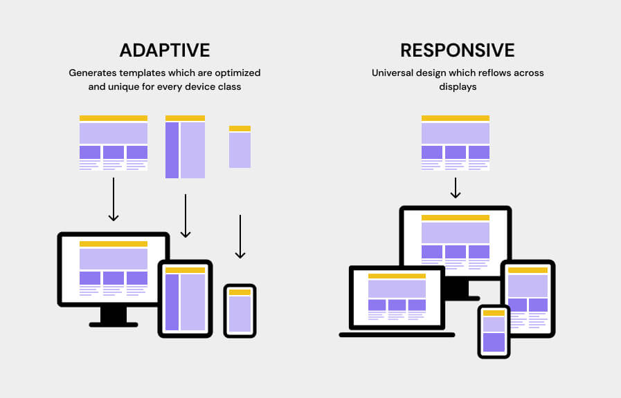
Responsive Web Design vs. Adaptive
If you sometimes (or often) find yourself getting bogged down with industry terminology and buzzwords, then you’re not alone. Identifying the difference between responsive and adaptive web design can be challenging, especially when both terms are thrown around almost constantly by marketing blogs. Adaptive design is an approach where different versions of a website are created for various devices, with server-side detection delivering tailored HTML code based on the device type to enhance performance and user experience. Not to mention, it often seems like both design styles do very much the same thing.
Well, we’re here to help.
Responsive vs. Adaptive
A responsive website retains the same design the same across all devices but has the built-in flexibility to change its layout and size according to the device being used. It is built to freely reformat itself based on the screen size and orientation, with the same basic content and design present across all versions.
For more detail, an adaptive website hosts a different design for each potential device’s screen. The website reads the screen size as it loads and presents the static design which has been created for that screen size and orientation.
Adaptive web design companies tend to build the website in six different ways according to the six most common screen dimensions. However, to minimize the workload they tap into user analytics. This allows them to identify the common screens being used and design the experience according to that data.
While adaptive web design services give the designer and creator full control over how the website will be viewed in each layout and on each screen, at the end of the day, the flexibility of responsive web design brings responsive design out on top. After all, new smartphones with different sized screens are now being released almost weekly. Responsive design allows your website to keep up with every single one.
With that said, let’s take a closer look at the pros and cons of responsive web design.
Pros and Cons of Responsive Web Design
By now, you should understand how responsive web design works—using a single flexible design that adapts to any screen size and orientation. Below are the key benefits and considerations when implementing responsive web design.
Advantages of Responsive Web Design
1. Future-Proof Flexibility
A responsive website accommodates an infinite number of screen sizes, from the smallest smartphone to the largest desktop monitor. As new devices enter the market, your website automatically adapts—no redesign required.
2. Superior SEO Performance
Google explicitly recommends responsive design and uses mobile-friendliness as a ranking factor. Responsive websites also benefit from:
- Single URL structure (better for link equity)
- Reduced duplicate content issues
- Improved Core Web Vitals scores
- Better crawl efficiency
3. Consistent Brand Experience
Responsive web design delivers a cohesive user experience across all devices, reinforcing brand recognition and trust regardless of how users access your site.
4. Easier Management and Maintenance
One website to manage means:
- Single content updates across all devices
- Streamlined analytics and reporting
- Simplified testing and optimization
- Lower long-term maintenance costs
5. Higher Conversion Rates
When properly implemented, responsive design can increase mobile conversion rates by up to 160% by removing friction from the user journey.
Considerations and How to Address Them
1. Requires Integrated Design and Development
The challenge: Designers and developers must collaborate closely to ensure the design works across all devices.
The solution: Work with agencies offering integrated multi-disciplinary teams where designers and developers collaborate from day one. This eliminates the coordination overhead and ensures responsive design is built into the foundation, not retrofitted later.
2. Less Pixel-Perfect Control
The consideration: You can’t control exactly how your website appears on every possible device.
The reality: This is actually a feature, not a bug. Responsive design prioritizes user experience over pixel-perfect control. Modern best practice focuses on design systems and flexible layouts that work beautifully across contexts rather than rigid fixed layouts.
3. Performance Optimization is Critical
The consideration: Responsive websites must be carefully optimized to maintain fast load times across all devices, especially mobile.
The solution:
- Implement modern image optimization (WebP, lazy loading, responsive images)
- Minimize unnecessary JavaScript and CSS
- Use content delivery networks (CDNs)
- Prioritize mobile-first performance optimization
- Regular performance audits and optimization
Note: When properly implemented with modern optimization techniques, responsive websites load just as fast—often faster—than non-responsive alternatives.
The Bottom Line
For the vast majority of businesses, the advantages of responsive web design far outweigh the considerations. The key is working with experienced professionals who understand how to implement responsive design correctly from the start.
When evaluating responsive web design companies, discuss how they address these considerations in their process. The best agencies build performance optimization, cross-device testing, and ongoing refinement into their standard workflow.
Responsive Web Design Testing
When searching for the perfect web design company to partner with, it is essential to look beyond the build itself. This means asking and considering what else they include as part of the package.
Testing a responsive website involves visiting your website across a series of different devices, starting your customer journey from different touchpoints and following different routes around your website to see how the design adapts to your screen size. This allows you to identify any stumbling blocks or obstacles for users, such as errors and buttons which don’t work. It also pinpoints any usability issues or challenges.
The whole point of building a responsive website is to leave the navigation as open-ended as possible. After all, this allows your website to adapt to the preferences of the users themselves. But before you can launch your site, you need to test it.
What to look for during the testing process
Some of the things to look for during the testing process include:
- Font sizing and color – is the content accessible and easy to read?
- Homepage and landing page aesthetics
- Consistency across different devices and different screens. Is the experience largely the same, and can you tell it’s the same website?
- CTA’s and navigational instructions – do they make sense?
- Buttons – do they work? How long does it take from clicking the button to the correct movement?
There is a multitude of tools out there that enable businesses to conduct additional in-house testing.
There are also plugins available to view your website from different screen sizes and dimensions. Testing is something that any responsive web design company will include as part of the package. Discuss regular testing and maintenance to ensure that any future errors are picked up quickly.
Ready to Transform Your Website into a Revenue Engine?
Responsive web design is no longer just about making your website look good on mobile devices—it’s about creating a conversion engine that drives measurable business growth across every touchpoint.
The right responsive web design company doesn’t just build websites; they build strategic assets that:
- Increase conversion rates through data-driven optimization
- Improve search rankings with mobile-first, performance-optimized experiences
- Reduce bounce rates by delivering seamless experiences across all devices
- Drive revenue growth through continuous testing and refinement
The Passionates Difference
- Fixed, Predictable Pricing: Starting at $5,000/month with no hidden fees or cancellation penalties
- Rapid Delivery: 1-3 day turnaround on most requests (not 2-3 weeks)
- Senior Expertise: All team members have 5+ years of specialized experience (top 0.5% of talent)
- Multi-Disciplinary Access: Design, development, UX research, CRO, and AI automation under one roof
- Flexible Scaling: Add or remove resources instantly without re-contracting
- Full Ownership: You own all deliverables with no vendor lock-in
Whether you’re launching a new responsive website, optimizing an existing site, or need ongoing design and optimization support, choosing the right partner makes all the difference.
Book a free consultation to discuss your responsive web design needs and discover how a subscription-based approach can transform your website from a digital brochure into a revenue-driving asset.
