Web design is one of the fast-changing and evolving industries in today’s digital world. And naturally, new trends in web design come and go very fast.
Still, many businesses ignore these trends and become outdated in the eyes of their customers. So, it’s very important to regularly update your website and follow the trends to stay relevant and not lose the trust of your customers.
To help you learn about the current trends, we’ve created this list of the latest trends in web design. Let’s explore all of them.
The Importance of Web Design Trends
But first, let’s talk a bit about the importance of following the latest trends in web design.
Well, it’s one of the main ways you can distinguish yourself from your competitors. You have to give your users a reason why they should choose you instead of the others. Especially after the pandemic made most of the stores go online, users have become pickier and now pay more attention to the design, speed and navigation of the website.
Besides that, there are also technical reasons related to SEO and website structure. Google and other search engines constantly change their algorithms to provide a better experience for the users. You need to regularly update your website to match their algorithms. And yes, they are related to web design, because, over time, your website becomes outdated and not user-friendly, so Google will stop bringing your website on search results.
Keeping up with the trends in web design will allow you to deliver a better user experience to visitors. Besides, easy navigation, fast loading speed, and modern design, all of these will contribute to the higher ranking of your website.
And, of course, you’d want to be seen as a trendy, professional business that cares about its customers and their experience on the website. You want your customers to like your products and your brand, right?
For these reasons, you need to pay attention to website trends and regularly update your website.
Latest Trends in Web Design
As we move beyond the web design trends of 2021 and into 2022, you will notice a focus on playful content and structure. Users are looking for innovative and exciting solutions and online experiences which stand out. 2022 is more about new, fresh experiences and outstanding designs.
1. Creative Scrolling
Creative scrolling is one of the best ways to make your design more interactive and interesting. By adding creative scrolling effects, you will encourage people to scroll through your website and see more of your content.
Scrolling effects are different types of animation, that appear triggered by scrolling. They are not a new thing, so you need to think out of the box to create something unique, but they are definitely one of the trends in 2022. The reason is, scrolling effects are becoming more complex and creative. Here is an example of a creative scrolling experience.
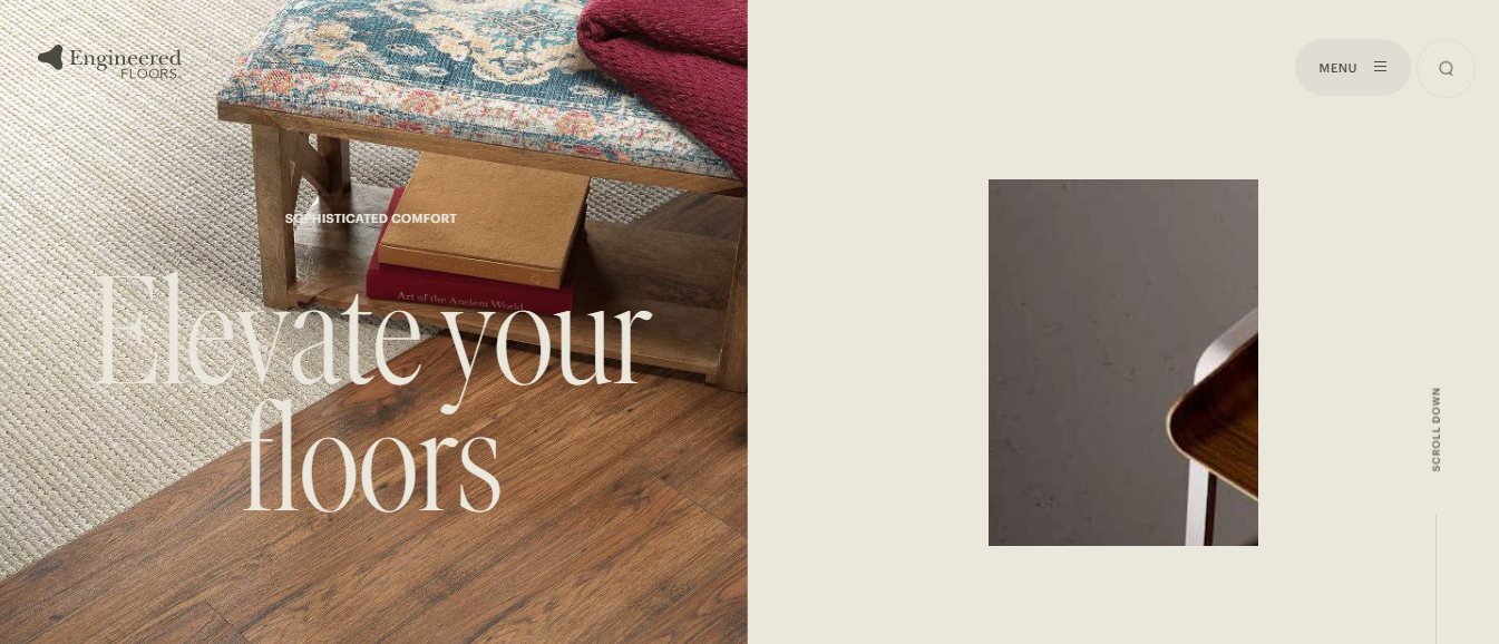
At first, the user sees only the chair, but when they scroll, they will see a living room. This is a very innovative solution, as it ties in scrolling animations with the story.
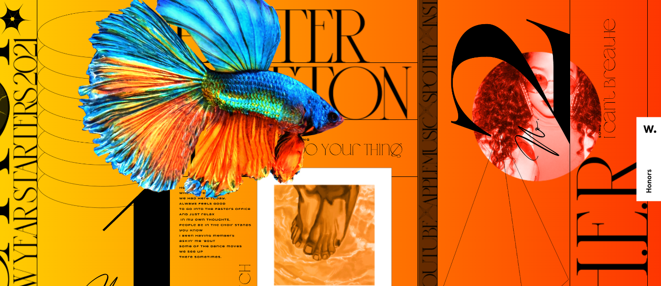
This is another good example of a scrolling effect. As you see, instead of vertical scrolling they use horizontal scrolling. It’s also quite distinguishing as a lot of websites use vertical scrolling. So, if your website content allows you, I’d recommend trying out horizontal scrolling.
Most of the scrolling effects use parallax design, which is a scrolling effect, where different layers of content or background move at different speeds.
As you see, there are a lot of options to make your scrolling more interactive and unique.
2. Memphis Design
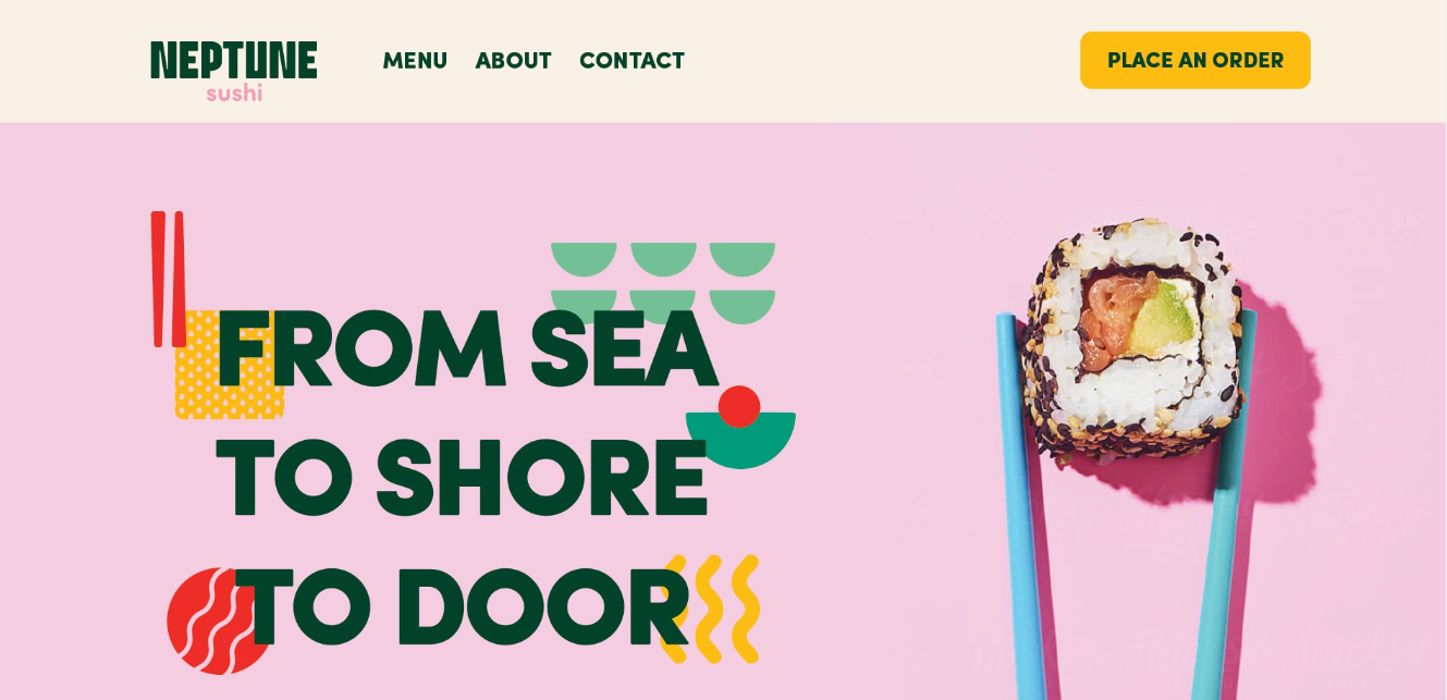
In recent years, everything was about minimalism and neutral colours, but it seems like bright patterns are coming back. While minimalism is still trendy(we’ll talk about it later) and results in a very intuitive design, it’s hard to surprise anyone with it. The thing is, with so many minimalistic designs out there, they have become too common.
And one of the ways to create a distinctive web design is to use Memphis design. Memphis design uses brightly coloured shapes, geometric figures, patterns and lines. By using this design, you can stand out from tons of minimalistic websites.
3. Experimental Navigation
Most of the websites use a traditional navigation style, where the navigation bar is at the top with sans serif typography. But you can go beyond that and create a different type of navigation, like this one. On this website, you will see that they placed the navigation bar at the top right, but they used a distinctive typography and font size, which makes their navigation unique.
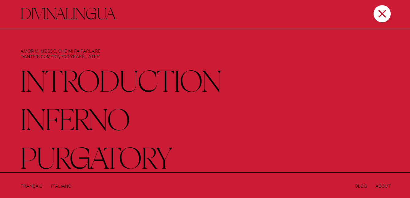
This trend is a bit tricky, as you need to also think about the user experience. You do not want to confuse visitors, they should easily find the navigation bar and understand how to use it. So, be careful. Just in case, test your website before launching.
4. Cinemagraphs
Cinemagraphs are videos, lottie animations and GIFs that run on a loop, like on this website. You can create a static website, but add a cinemagraph and make it more dynamic. Cinemagraphs have become quite popular recently and they are a great way to drag users’ attention to where you need them to look.
Cinemagraphs are not a new thing, and you’ve probably seen websites before where there is one huge cinemagraph over the entire page. Now, trends are towards smaller cinemagraphs, used in complex layouts, which draw the attention of visitors and look quite fresh and innovative.
5. 3D Elements
I think you won’t be surprised by this one. As the world of technology and design evolves, we see more and more complex elements incorporated into website designs. Before, 3D, animation and other advanced elements were too expensive and impossible to use for average websites. But now, they are more accessible than ever and can help to achieve a much higher quality look.
Here are some examples:
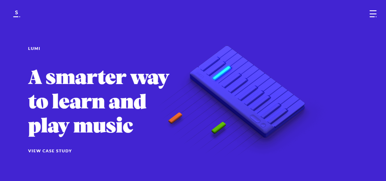
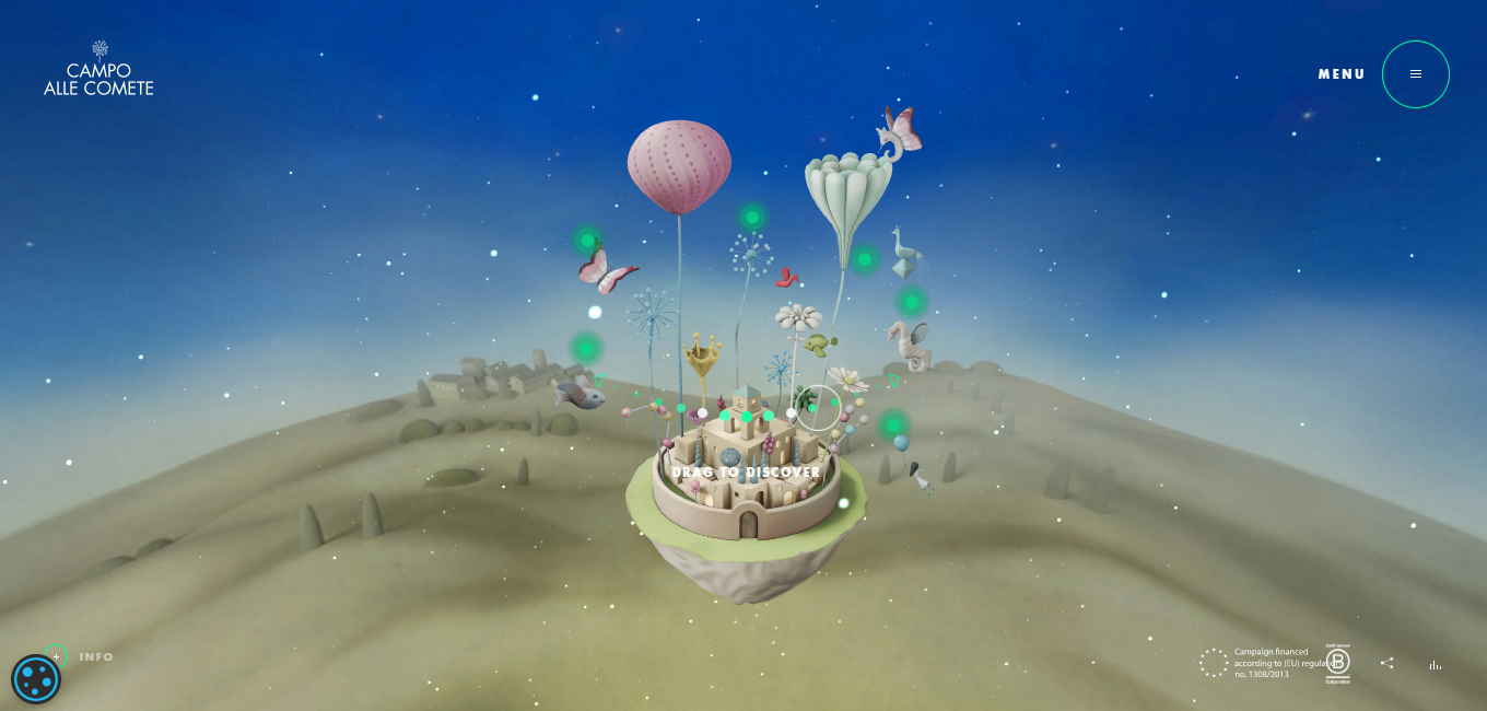
Overall, the current design trends go towards interactive elements, animation and 3D designs. But remember to be careful with these. If you put too many heavy 3D elements, it may affect your load time and may become too distracting for the users.
Typography
There are many typography trends that we need to talk about. But in short, 2022 typography trends are characterized by bold, sophisticated styles.
6. Retro Typography
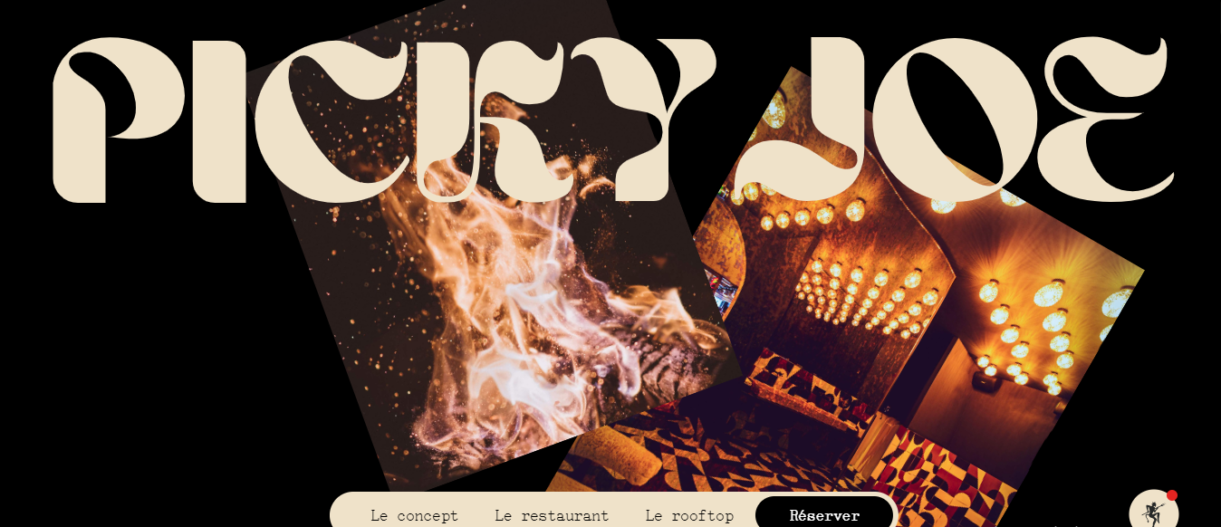
And the first one is retro typography. If your business’ style is related to retro and you want to add a nostalgic feeling and sentiments to your branding, you can use retro typography, as Picky Joe restaurant did. Note how the photos match the retro feeling of the typography.
7. Thin Serif
This trend is more about adding some sophistication to your brand. Of course, you need to know the limits and not choose something too complex, which makes it hard for the reader to read the text.
Before, serif fonts were hard to use due to screen resolution limitations and lack of support for this kind of font. But now, these limitations are fading away and designers can be bolder and use sophisticated fonts.
Bold and big serifs were already on trend in 2021, but 2022 is more about thin and light serif fonts. Check this page to learn about the typography trends of 2022.
8. Animated Typography
Animated images and illustrations have been a trend for quite some time. And in 2022 animation is still on trend, especially animated texts, like on this website.
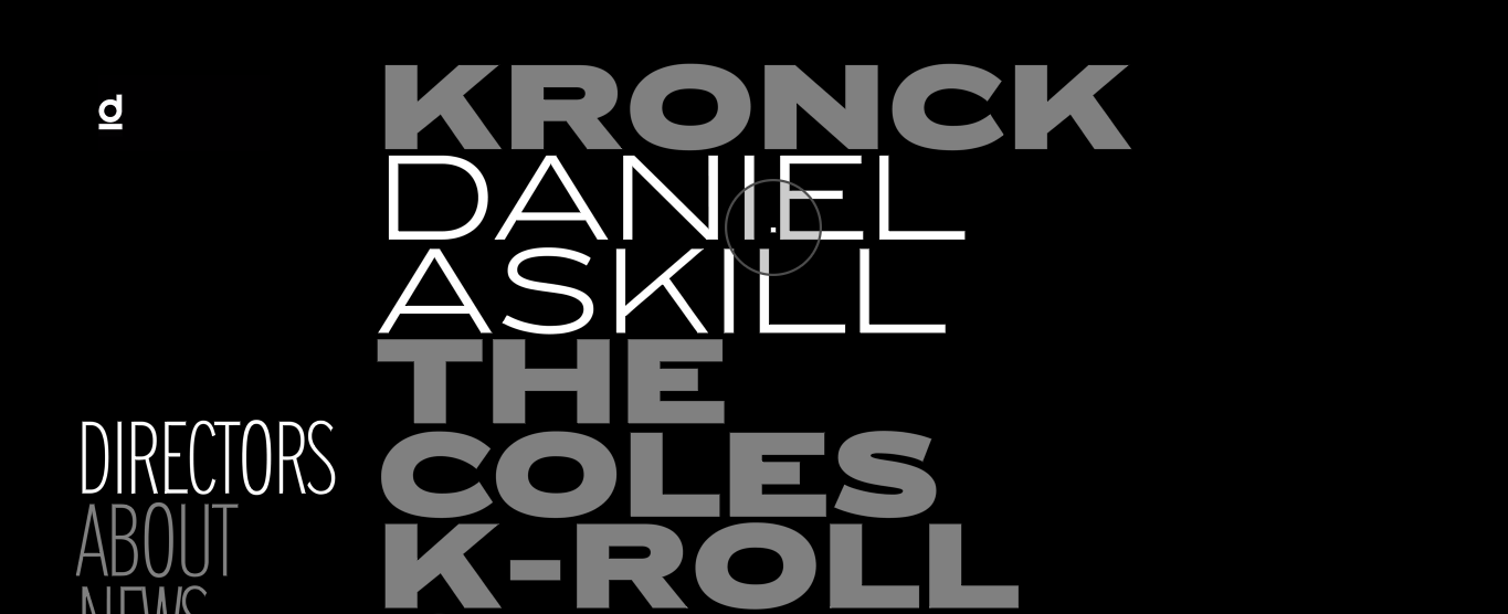
When you move the cursor, the typeface changes. This website is very minimalistic, and animated text makes it more dynamic and modern. There may be a lot of websites that use different kinds of animation, but not so many use kinetic typography.
9. Text-Only Hero Section
This one is a bit contradictory to what we’ve talked about above, but it’s certainly worth mentioning. Your website can still look fresh and modern whilst being minimalistic. You can simply create text-only hero sections and look professional and trendy.
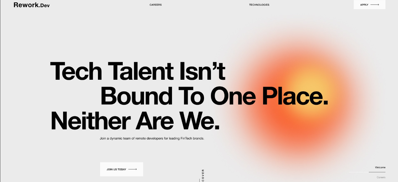
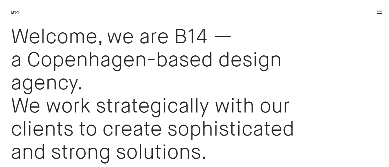
These websites use text as the main element of their hero section. It’s minimalistic and draws the attention of users to the main message of the website. No need to use colours, images or sophisticated fonts.
But be careful, these designs seem easy and simple, but they are much harder to create than you think, in order not to lower the quality of user experience.
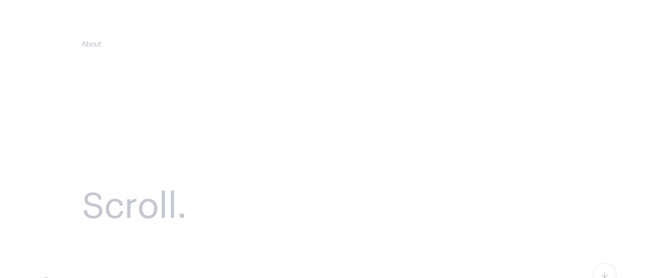
10. Ultra Minimalism
Minimalism is still trendy. It’s a very modern and simple type of design that doesn’t contain too many elements and thus is very good for load speed. But now, instead of classical minimalism, ultra minimalism has become popular. Ultra minimalism includes only the bare minimum of elements a website needs, like this one below.
11. Brutalism
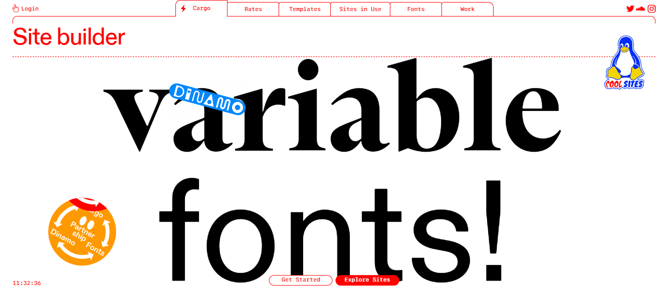
Similar to minimalism, brutalism is about simplicity, but also the functionality. An architectural movement of the 50s-70s, brutalism exposes raw materials, like concrete. In the digital world, it emerged in 2014 and is still popular today. Brutalist-style websites are characterized by plain backgrounds, default fonts, untreated photos, and a lack of hierarchy and order.
2022 is more about neo-brutalism, a less extreme version of it, combined with restrained tastes of minimalism. Neo-brutalism is more universal, so brands from different industries, other than design and architecture, can also implement it in their style. Check the example below.
12. Layers
As mentioned before, recent years were all about minimalism, and clean designs. And many designers were avoiding complex and colourful website designs. But now, colours and complex designs are coming back and in the future, we’ll see more of them.
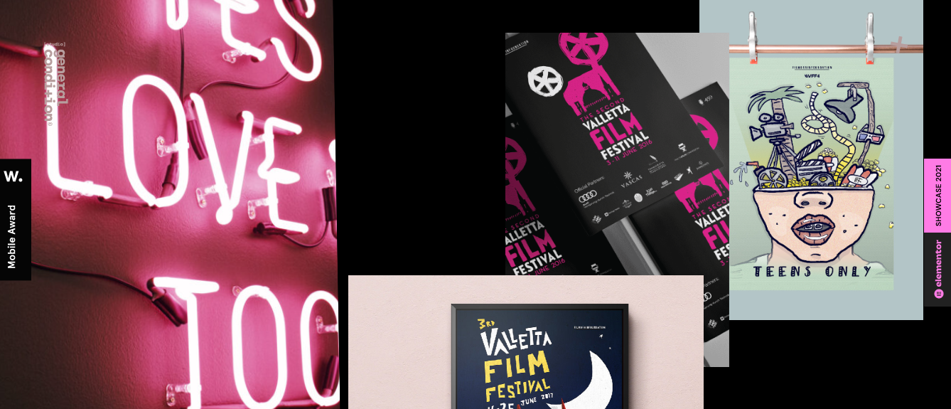
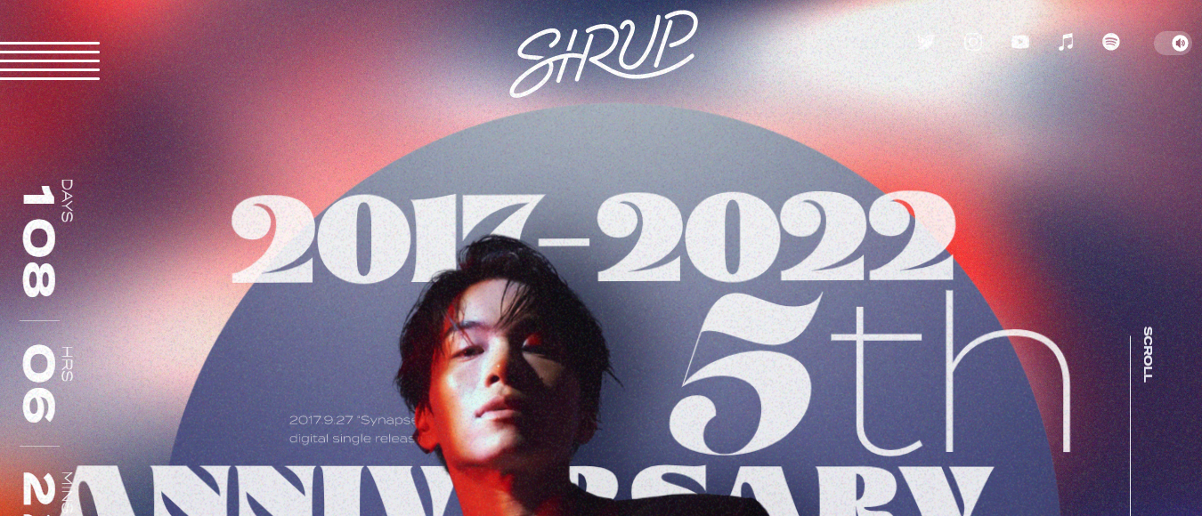
One of the very interesting trends on 2022 is layering. Layers create a sense of depth, and combined with creative scrolling can create an unusual immersive experience for users. Visitors would more likely stay on your website if you display your content by layering it. Here are some interesting examples that can inspire you.
13. Grids
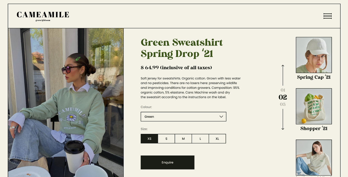
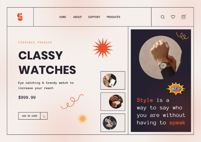
Most of the time, grids and borders are not visible, though they always exist in the code. The gridless structure adds a sense of lightness and a more subtle connection of the website elements. Though, recently designers have started using borderlines and frames, and have added some freshness to borderless structures.
Borders add a more structured and uncluttered feel to the website. Your content won’t seem to be overlapping with each other. Besides, visible grids also give a retro touch to the 90s. If you look through the trendy colours and styles of this year, many of them would remind you of the 80s and 90s.
14. Online Games and Puzzles
Giving a user a sense of achievement when they enter your website is not only popular but is a growing trend in web design. With escape rooms and scavenger experiences so popular pre-lockdown, it follows that online versions grew in popularity during the pandemic. You don’t have to be a gaming website to build puzzles and games into your website.
A great example of this in action is event companies using a scavenger hunt to reveal a venue. Hiding the venue behind a series of clues and puzzles adds an extra level to the event and extends the experience. Not to mention, it makes the website shareable, and memorable, and generates conversation before the event has even begun.
15. Inclusive Copy and Design
Regardless of trends, you should make sure that anyone feels comfortable using your website. User experience is still the top trend of all time.
The idea behind inclusivity and accessibility is that every user should feel like the website was made for them. This includes gender-neutral design (no more ‘pink for a girl and blue for a boy’) and inclusive copy. Regardless of their gender, accessibility, or lifestyle choices, the website should appeal to them through its imagery and wording.
Someone with visual impairments, for example, may not be able to read coloured copy on a coloured background. The more contrast you can create between wording and the background, the better. Likewise, choosing a legible font is more important than ever in enabling every user to understand the website.
You should forget about the stereotypes and create a website that is accessible and comprehensible for everyone.
Current Trends in Web Design You Shouldn’t Overlook in the Future
The main trend to remember for now and for the future is usability and accessibility. Especially with the talks about metaverse and Web 3.0, the digital world will only continue to grow. People rely on digital and online services more than ever, and more and more businesses are adapting to users’ needs and switching their brands to the online market.
Though trends in web design change constantly, you should remember that you just need to think about how your audience would like your design. Not all people will appreciate your innovative methods and extra-creative design. You must always think about your users first before changing your website’s design.
Another trend which should not be ignored is mobile responsiveness. Almost 60% of website traffic comes from mobile. If your website is not responsive, you’re going to lose a lot of potential customers. This is a major turn-off for many users, and with mobile phones as an important part of modern life, having a responsive website is crucial.
Summing Up
As you see, current trends in web design are very contradictory. They include both overly minimalistic designs and colourful and bold designs. This gives the designers a large area for experiments and the possibility to use all their imagination to create extraordinary designs. Also, this creates a lot of options for brands, even those working in traditional, conservative industries to make their website designs trendy.
And I hope, our list of trends will help you to get inspired and create something memorable for your audience.
Increase brand awareness, build trust and drive conversions.
A professional website custom-made for your business increases your customer trust and helps you build a better connection. And once that is done, you can expect improved purchase rates, customer loyalty and brand awareness.
Book an online consultation
General FAQ
What is the #1 trend for 2022?
Accessibility covers a number of bases, from inclusivity in content to mobile responsiveness and design. When you focus on making your website accessible, you allow users from all walks of life to use it.
Can I implement web design trends with a DIY website builder?
DIY website builders are a trend all of their own. WordPress and other website builder tools make it easier than ever for businesses to embrace online. They do this by presenting templates and built-in features that bring a business to life. Alternatively, using a web design company helps to ensure that everything is professional.
What if I don’t like the design of my website?
Sharing a clear brief and structured feedback is important when working with a web designer. We have created an article on giving web design feedback, which should help you discuss the pros and cons of a website.
How can I implement the current web design trends in my website?
The first thing to do is an online audit, considering the highlights and sticking points of your current website. This can look at usability, accessibility, and design aesthetics. You can then work with a web design company to identify the trends which might enhance the user experience on your site.
