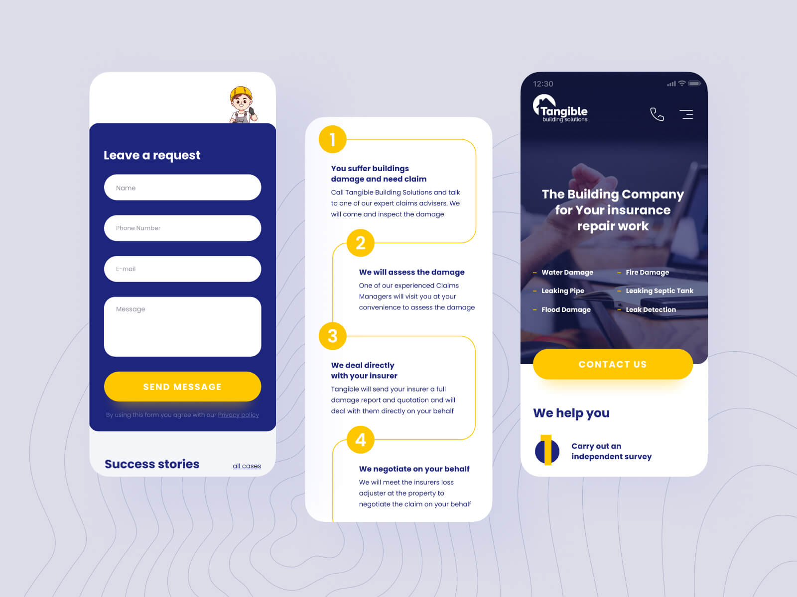
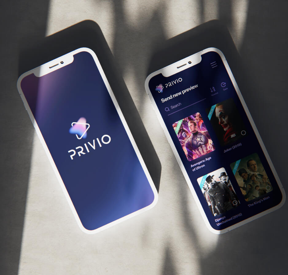
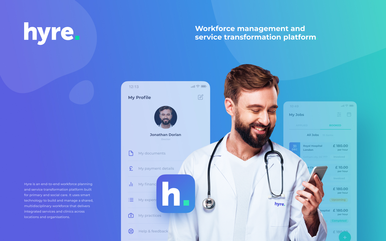
Mobile apps have become an essential part of everyone’s lives. For the time spent on mobile phones, almost 90% comes on mobile apps, compared to browser usage. And with the increasing number of people using mobile phones for shopping, banking, and other purposes, it’s crucial to have a winning mobile app design to attract more of your target audience.
However simple it may seem, designers have to consider many things to create an appealing mobile app design for the best user experience. And in this article, we’ve collected essential mobile app design tips to help you build a successful app. Whether you’ve just started designing your mobile app or simply looking for tips to improve the UI/UX of your app, this article can help you create a unique and high-quality app design.
Let’s get started!
Keep the App Design Simple
Let’s begin with one of the most obvious yet underrated tips. The simpler the design, the easier and more comfortable it is for users. Too many design elements and complex interfaces make the user experience overwhelming and frustrating. It’s better to have fewer but more researched and functional design elements.
Smartphones have small screens, and cluttered design looks way worse on them than on a desktop. Using a lot of gradients, animations, or other design elements can make the app look confusing for the users, and it can also affect the load speed of your app.
Focus on one major functionality per screen so that users won’t be overwhelmed with too many buttons, forms, or information. Users generally stick with apps that are easy to understand and comfortable to use.
Don’t Make Users Wait too Long
Speed is as important for websites as it is for apps. A slow-loading app may make users think the app is not working properly, and they might leave it immediately. Optimize the app speed regularly to make sure it loads quickly.
Also, there’s an interesting tip for creating a feeling of fast loading speed. For websites, designers use the loading sign. For apps, you can use skeletons of pages to create the feeling of a fast loading speed. Facebook and other popular apps use this quite a lot.
Remember that a blank white screen may make users think that the app is not working properly, and they might get frustrated and confused. So make sure your app loads fast enough when working on the development, and use skeletons of pages to make users think the app will load very soon.

Use Familiar Design Patterns
Users are used to a certain type of navigation and design patterns, which help them feel more comfortable using the app. If you try to change these design patterns that are universal to all apps, it may frustrate users and make them leave your app.
Of course, creating a unique design is important, but don’t try to reinvent the wheel. You can create a unique design by adding custom graphics, branding colours, and patterns. Make sure you research well your customers’ behaviour and preferences so as to create an app they feel comfortable using and not to change the design patterns they are familiar with.
Use Clear and Concise Language
The content of the app is as important as the layout and design. And here also applies the rule the simpler, the better. Don’t try to be creative and use unusual language. Users are already used to a certain type of navigation and language. If you try to change that, they’ll be confused and may refuse to use your app.
Avoid acronyms, brand-specific terms, and technical terminology. Make sure to do proper research about the wording, too, so as to create simple, clear, and concise copy that all your users will be comfortable with.
Avoid Dead-End Pages
Creating a seamless customer journey is one of the most important things about UX. It implies that your app shouldn’t have any dead-end pages. When users go from screen to screen and meet an error or blank screen without any link to exit the error page, they need to take extra actions to go back or continue their previous actions.
Dead-end pages often frustrate users and negatively impact their experience. So, try to avoid them. Also, if errors occur, make sure you provide instructions and actions on how to leave the dead-end page.

Test Before Launching
To ensure users will like your app’s features and feel comfortable and confident when using it, you need to test the app before launching. And besides worrying about users’ convenience, you must ensure your app works equally well on all devices and screen sizes. This way, you can fix all the errors before the end users even see them.
Also, make sure all the buttons and finger touches are large enough. Small buttons and taps can be very frustrating, as users won’t be able to tap on them. Generally, a size of 7-10 mm is considered enough for a button. It also depends on which kind of button you’re going to create, but in any case, this is a good reference.
Don’t Lead Users to the Browser
When you try to take the user outside of the app to complete an action or to show more information, it might result in high abandonment rates. Users don’t want to wait until it redirects to the browser so as to reach their desired page.
If you can’t make a certain action be completed in the app, use the in-app browser instead. It creates the feeling that the user is still in the app and doesn’t have to quit the browser to return to the app.
Don’t Ask to Rate or Review During the First Use
Ratings and reviews tell a lot about an app; they can influence the opinion of new users and encourage or discourage them from downloading the app. And it’s also useful for the mobile app design and development team. Reviews help to understand if there is anything wrong with the app and what changes the designers can make to improve the user experience.
And it’s only natural that designers and developers want to ask for rates and reviews as soon as possible. Though, it can negatively impact the opinion of the users. Asking for a review when the user is unfamiliar with the app won’t give any results. Plus, it will frustrate the user.
It’s better to wait until the user tries the app several times, completes some actions, and gets a good understanding of the app before asking them to rate the app. If they have a positive impression by that time, they will likely give you good ratings and reviews.
Also, make sure not to interrupt them during important actions. Try to request a rating or review when they are most likely to make a pause.

Make the Onboarding as Easy as Possible
Onboarding is meant to teach first-time users how to use the app and describe its key features. But sometimes, onboarding can be too long or include unnecessary elements that may frustrate users and make them leave your app without even trying.
Make sure you carefully plan the onboarding so that users don’t get frustrated. Don’t include unnecessary details about the app, only describe strictly necessary features that can be hard to understand without description.
Create Legible Text
We’ve already talked about the content, but this refers more to its design. Remember that the app screen is quite small, and when you put some text on it, you need to make it legible.
Try to use larger fonts, and don’t go for fancy typography. Besides the size, the fonts also can make the text illegible.
And what refers to the content itself, it’s better to be brief and laconic. You need to give as much information as possible through little text. Try to shorten the text so it won’t look too cluttered on the screen.
Do a Thorough Research
We’ve talked about many tips, but this is one of the most important ones. Research is the key to creating a successful app that provides the best user experience. You need to know everything you can about your users, why they would need your app, and what features would be the most important to them.
Make sure you know all your target audience’s preferences and update the features of your app when their preferences change. Users are not going to pay attention to the unnecessary features of the app, and it’s better to get rid of them.
And remember to research your competitors as well. Pay attention to their apps’ features, what they have that your app doesn’t and how their app is better/worse than yours. All of this information is going to help you to create a better user experience.
Follow Trends
Of course, you shouldn’t only focus on trends when creating a mobile app design, but completely forgetting about them is also not recommended. Make sure that along with the target audience research, you also research the latest trends in the industry.
In our digital world, everything changes so fast that you need to constantly monitor the trends and update the app design regularly to avoid appearing outdated.
Use High-Quality Imagery
To make your app visually appealing and engaging, it’s crucial to use high-quality graphics and images. Take into account that users are using different smartphones and screens, and even if the poor-quality images look good on one device, they may look bad on others.
Make sure to check all the imagery and ensure they are high quality. Though, it’s important to note that high-quality visuals take up more space. So you also need to make sure they don’t slow down your app.
Collect Feedback
Feedback helps you determine if there are any issues with the app, what improvements it needs, and what can make the experience better for the users. Make sure you analyze the reviews from users and remind them to give feedback from time to time.
You can also create surveys or quizzes to get more feedback and understand whether your app works properly and exceeds the users’ expectations.
Don’t ask to review only one feature; try to ask them questions about usability, design, and onboarding flow to get more useful information.
Monitor Crashes
App crashes are one of the most common causes of why users leave the app. They can happen because of memory management, device compatibility issues, excess code, or other reasons. And you need to monitor your app regularly in order to address the crashes on time.
When the app is live, monitor it to notice if there are any crashes. Also, encourage users to give feedback about the crashes so that you know when something is wrong and can fix it fast so as not to affect the user experience.
Implement Push Notifications
Push notifications are a great way to enhance the app’s usability and improve their journey with your app. You can use them in various ways to remind people to use the app. But, remember that it’s important not to disturb users with unnecessary messages.
Depending on your industry and app, you can implement reminder push notifications, delivery updates, shipping confirmations, sale offers, and limited-time offers. Make sure that these notifications are not too frequent and are delivered at the right time.
Make Your App Accessible to Everyone
If you want your app to be used by as many people as possible, you need to make it accessible to everyone. There are people with disabilities who may face difficulties when using digital products.
Try to evaluate your app and see whether they can use it too. Not all brands consider this option, so by making your app more accessible, you can gain more users compared to your competitors.
Improve Constantly
App design and development is not a one-time task. It’s continuous work that needs constant monitoring and updates. If you want the user to use your app comfortably, you need to make it compatible with the latest Android and iOS versions, address the crashes, redirect the dead-end pages and make improvements.
Make a schedule for your app monitoring to ensure you’re always aware of all the errors and issues. It’s also important not to forget about the design. Pay attention to users’ feedback and update the app design according to users’ wishes and preferences.
Final Words
Creating a mobile app design is quite tricky nowadays. With all the trends changing every day, tough competition, and picky users, app designers need to be very careful if they want to create an app that offers real value to people.
We’ve collected important tips in this article to make your job easier. They can be helpful both for designers creating the app design from scratch and for those who are only redesigning. Follow these tips, and your app design will have more chances to be unique, competitive, and have a great UX.
Increase brand awareness, build trust and drive conversions.
A professional website custom-made for your business increases your customer trust and helps you build a better connection. And once that is done, you can expect improved purchase rates, customer loyalty and brand awareness.
Book an online consultation
General FAQ
What does the mobile app design process look like?
The app design process involves designing the User Interface (UI) and User Experience (UX). Designers research, ideate, and create wireframes of an app, then design the structure and flow, and finally, create the UI, consisting of choosing the colours, fonts, etc.
What makes an app design high quality?
A high-quality app design provides a flawless user experience. It has easy-to-understand navigation, aesthetic design, works without bugs and provides value to users.
Is it worth creating a mobile app?
Recently, many brands have started building apps to get more customers. But this doesn’t apply to all industries. If you’re considering building an app, do some research first and understand whether your customers need it and what value it will bring them.


