As the Internet has become an essential means of communication, it’s more important than ever to reach target audiences through online channels. Responsive web design is now considered a baseline requirement, with mobile devices accounting for approximately 60% of global web traffic as of 2024—a trend that continues to accelerate. This article is for business owners, marketers, and web developers who want to understand why responsive website design is essential for modern online success. Nowadays, most brands build an online presence through social media, email marketing, and websites. And a website is one of the crucial assets of all of them. Before diving into implementation or optimization, it’s important to have a basic understanding of responsive website design as a foundation for a modern web presence.
While it’s essential to build a high-quality website to appeal to the target audience, it’s no less important to make the website accessible on all devices. The reason is that – Mobile traffic now dominates the digital landscape, making responsive design essential rather than optional.
And one of the best ways to ensure that the website works without any issues on all devices is to create a responsive website design. Search engines like Google prioritize mobile-friendly websites, boosting SEO for sites that use responsive design. If you’re not a designer, you may not be very familiar with this term and wonder why you need to invest in building a responsive website design. So, in this article, we’re going to explore what a responsive website design is and why it’s a must-have for every brand that wants a strong online presence. To launch a successful website, responsive design ensures a consistent user experience across all devices, which is crucial for brand success.
What is a Responsive Website Design?
First, let’s clearly define what a responsive website design means.
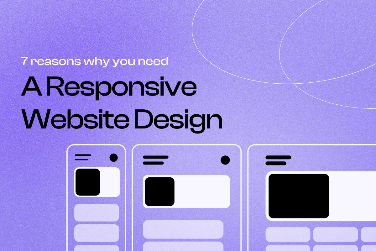
Responsive website design is a method of designing and building a website that provides an equally high-quality experience on all devices. A responsive site uses fluid layouts and flexible grids to adapt to different screen sizes, ensuring that content looks great whether it’s a smartphone, tablet, or desktop. Fluid grids use relative units to create layouts that adapt to different screen sizes. Flexible layouts are essential for responsive design, allowing elements to resize and rearrange based on the viewport size. Whether it’s a smartphone, tablet, or desktop, users can view the website without zooming in and out, resizing, or scrolling.
A responsive website’s code is written in a way that it can determine the device the user uses and can automatically resize the website’s content and layout to match the device’s screen. Responsive design adapts the same page dynamically for all devices, providing a unified experience. The goal of a responsive website design is to make websites easier to navigate for users so that they won’t have to put extra effort into examining the page.
Besides, this is an alternative way to creating separate websites for each device. Before, brand owners had to create 2 or 3 different websites with separate codes for mobile, desktop, and tablet screens. With responsive design, they don’t need to create separate websites anymore. Responsive web design allows for a single codebase for all devices, reducing the risk of duplicate content penalties and improving SEO. It’s important to note that responsive web design is not a separate technology, but a set of best practices using existing web standards like CSS, media queries, fluid layouts, and flexible grids. Media queries are CSS techniques that allow specific styles to be applied based on the characteristics of the user’s device, such as screen width.
Modern platforms like WordPress and Webflow have made implementing responsive design more accessible, offering built-in responsive frameworks and flexible templates. However, achieving optimal results requires expertise in configuring these systems to match your specific business needs and user behaviors.
Key Components of Responsive Website Design
Responsive website design is built on a foundation of several essential components that work together to deliver a seamless user experience across a wide range of devices and screen sizes. At the heart of a responsive website are flexible layouts, media queries, and responsive images. Flexible layouts allow content to adapt fluidly to different screen sizes, ensuring that users always see a clear and organized page whether they’re on a desktop, tablet, or mobile phone. Media queries are used to detect the characteristics of the user’s device, such as screen width or orientation, and apply the appropriate CSS styles to optimize the layout. To achieve optimal responsiveness, you should add multiple media queries at various breakpoints within your CSS stylesheet, targeting different device characteristics and screen sizes—this allows you to adjust layouts, font sizes, and images for a seamless experience across all devices. Responsive images ensure that visuals scale and load efficiently, maintaining quality and performance on any device. By combining these elements, web developers can create responsive web pages that look and function beautifully, providing a consistent and seamless user experience for everyone, no matter what device they use.
Flexible Layouts
Flexible layouts are a crucial part of any responsive website. Instead of relying on fixed pixel values, flexible layouts use relative units like percentages or ems to define the size and position of elements on a web page. This approach allows the layout to automatically adjust to different screen sizes, from large desktop monitors to compact mobile phones. By designing with flexible layouts, web developers ensure that content remains readable and visually appealing, regardless of the device. This not only improves the user experience but also guarantees a consistent look and feel across all platforms. Whether a visitor is browsing on a tablet, smartphone, or desktop computer, a responsive website with flexible layouts adapts to their needs, making navigation and interaction effortless.
Designing for Different Devices
With the rapid growth of mobile devices, designing web pages that render well on every screen has become a necessity. Responsive website design ensures that your web pages look great and function smoothly on all types of devices, from smartphones and tablets to laptops and desktop computers. By considering the unique requirements of each device, web developers can create responsive websites that automatically adjust layouts, font sizes, and navigation elements to fit the user’s screen. This approach not only enhances usability but also ensures that your brand delivers a high-quality experience to every visitor, no matter how they access your site.
Mobile First Design Approach
The mobile-first design approach is a best practice in modern web development, focusing on designing for mobile devices before scaling up to larger screens. By starting with the smallest screen sizes, developers prioritize essential content and features, ensuring that mobile users have a fast, efficient, and enjoyable experience. This strategy involves using CSS media queries to apply different styles and layouts based on screen size, allowing the responsive website to adapt seamlessly as the viewport changes. Employing relative units, a flexible grid layout, and responsive images further enhances the adaptability of web pages, making sure they look and perform well on any device. By adopting a mobile first design, web developers can create responsive websites that provide a consistent and seamless user experience across all devices, improve search engine optimization, and drive better business results.
Benefits of a Responsive Website Design
As you now know what a responsive website design is, it’s time to learn more about its benefits. A responsive site offers:
- Cost efficiency
- Improved user experience
- Better search engine rankings
by adapting seamlessly to various devices and screen sizes using techniques like media queries, flexible grids, and fluid images.
A responsive website is also easier and cheaper to maintain than managing multiple versions for different devices, leading to improved business performance. Additionally, responsive web design helps reduce bounce rates by providing a better user experience, which can lead to higher conversion rates.
Let’s go!
SEO
SEO or search engine optimization is the process of optimizing a website so that it ranks higher on SERPs (search engine results pages). A good SEO strategy can help websites to get more organic and quality website traffic. A responsive website design is one of the SEO ranking factors, as it improves SEO by offering a consistent user experience and faster load times, which can increase a website’s visibility and organic traffic.
To ensure the best user experience, Google has announced that they prioritize mobile-friendly responsive websites. So if your website is not responsive, Google will think that you don’t provide a quality mobile user experience and will rank you lower.
Remember that Google’s primary goal is to give users relevant, high-quality search results. And responsive design has become one of the essential criteria in determining relevant, high-quality websites by providing a consistent user experience across different devices and screen sizes.
Besides, if you don’t have a fully functioning mobile version of your website, users won’t stay on your website’s mobile version long, which will increase your website’s bounce rate. And that will negatively impact your rankings as well. Optimized responsive designs often load more quickly on mobile devices by serving appropriate image sizes and avoiding unnecessary redirects.
With a higher ranking in the SERPs, your website has more chances to get increased mobile organic traffic. Responsive web design also allows for a single codebase for all devices, reducing the risk of duplicate content penalties and further improving SEO.

Website Maintenance Savings
Cost-Effectiveness
Businesses’ main goals are to increase sales and avoid extra costs to get more profit. If you have the possibility to build one responsive website design, why put your time and resources into creating two or more different websites?
Also, many business owners forget about the fact that besides building and designing a website, they need to manage and maintain it. Website maintenance is important if you want your website to work correctly, without errors, and have satisfied visitors. Having two different websites will increase the costs of building and maintaining them.
Easy Updates Across Devices
Flexibility to Make Changes
We’ve talked about cost effectiveness in the previous point, but besides that, responsive website design also allows you to make changes to your website easily. And when you make the changes, you can be sure that they will be effective on all the versions of your website.
Every website needs regular maintenance, updates, content, and design changes. Website maintenance is important for keeping your website performance at a high level and ensuring that users don’t face any errors or issues. Besides, think about the small changes; if there’s a typo or a small design change you want to make, you’ll have to do it on two different websites.
Also, think about all those plugin updates, code checks, compatibility issues and many other things needed for maintaining a website. Responsive website design allows for a single codebase for all devices, making updates and maintenance easier since you only need to update one set of files. A responsive website can make your job much easier, as you’ll have to worry about only one website.
Moreover, it’s convenient for the marketing aspect as well. Which link do you need to include on your social media, the desktop or mobile version? What about email newsletters? With a responsive website design, you won’t have to worry about any of these issues.

Accessibility and Usability
Better User Experience on Mobile Devices
Let’s forget about search engines and business benefits for a moment. Your website was built for purpose, it was created to satisfy the needs of your target audience. In any case, you need to think about their convenience too. A consistent user experience across all devices is crucial for user satisfaction and encourages repeat visits.
With mobile-dominant traffic patterns now the norm across industries, delivering an exceptional mobile experience directly impacts your bottom line. Responsive behavior ensures that layouts, images, and interactive elements seamlessly adjust for optimal user experience on desktops, tablets, and mobiles. Responsive typography adjusts font sizes based on screen size to ensure readability, while flexible images scale proportionally and use the max-width property to maintain their aspect ratio within their containers. These features not only enhance usability but also improve accessibility by incorporating adaptable fonts and layouts for users with disabilities.
This is especially important for eCommerce businesses, as your website is the main source of income, and by not considering its mobile-friendliness, you may lose around half of your customers.
Impact on Page Load Times
Faster Page Speed
Page speed is one of the important ranking factors for SEO. It has a great impact on the bounce rate and user satisfaction. If your website is not optimized for mobile devices, it will take much longer to load on smartphones. And you may notice that the bounce rate is much higher than on the desktop version.
Besides, if users are frustrated by your website on mobile, they may not want to open it on a desktop. When your website has a responsive design, it will likely load faster and ensure users are content. Of course, there are many other factors that influence page speed, but having a responsive design is another step towards a faster website.
P.S. A good page speed is within 1-2 seconds; if it takes longer than 3 seconds to load a page, you need to check and try to improve it. Google Page Speed Insights can help you improve your page speed by providing page speed information for mobile and desktop website versions.

User Interaction and Trust
Improved User Engagement
A responsive website design with better navigation makes it easier for users to interact with your website and content, improving user engagement. When users feel more comfortable using your website on mobile and other devices, they are more likely to stay on the website longer, read your content, examine your products and even purchase them.
Besides, a responsive design also helps to gain the trust of your customers and build brand credibility, as it shows that you make efforts to make the user experience as good as possible and that you care about your customers.
Driving More Sales
Increased Conversion Rates
We’ve already said multiple times that more than half of the web traffic comes from mobile devices. That means you may lose half of your traffic if your website doesn’t work well on mobile devices. Of course, these numbers vary depending on the industry, but it’s especially true for B2C.
After all, every business’s goal is to increase profit through sales and conversions. A responsive website design can ensure that you attract customers from all possible channels. And more importantly, you will get customers who are satisfied with their user experience.
All of this will lead to better website performance, and with a great sales and marketing strategy, it will likely lead to more conversions and increased sales.
The connection between responsive design and conversion optimization runs deeper than many realize. A truly effective responsive site doesn’t just resize—it adapts the user journey to match device-specific behaviors and contexts. Mobile users often have different intent and constraints than desktop users, and your responsive design should account for these differences through strategic layout choices, streamlined navigation, and optimized conversion paths.

Responsive Design as a Conversion Optimization Foundation
Responsive design isn’t just about making your site look good on different devices—it’s a critical foundation for conversion rate optimization (CRO). When your website adapts seamlessly to any screen size, you eliminate friction points that cause users to abandon their journey.
Consider the mobile checkout experience: a responsive design ensures form fields are appropriately sized for touch input, buttons are easily tappable, and navigation remains intuitive. These seemingly small details can dramatically impact conversion rates. Research shows that even a one-second delay in mobile page load time can reduce conversions by up to 20%.
Beyond the initial implementation, responsive design enables more effective A/B testing and experimentation. With a single codebase serving all devices, you can test conversion hypotheses more efficiently and gather cleaner data about user behavior across the entire customer journey. This unified approach to optimization delivers faster insights and better results than managing separate mobile and desktop experiences.
Technical Considerations
Implementing responsive web design requires attention to several technical details to ensure your website delivers a consistent user experience across all devices. One of the most important tools is CSS media queries, which allow you to apply different styles based on screen size, device type, or orientation. By using media queries, you can create responsive websites that adapt layouts, font sizes, and navigation elements to fit everything from mobile phones to large desktop computers.
A key best practice is to use relative units—such as percentages, ems, or rems—instead of fixed pixel values. This enables elements to scale fluidly, making your web pages render correctly on a variety of screen sizes. Building your site on a flexible grid layout, or using modern CSS grid layout techniques, allows content to rearrange itself dynamically as the screen width changes. This is especially important for maintaining usability and visual appeal on both small and large screens.
Don’t overlook the importance of the viewport meta tag, which sets the viewport width to match the device’s screen width. Without this tag, your responsive design may not display as intended on mobile devices. Additionally, advanced features like JavaScript libraries can be used to enhance responsive behavior, while multiple media queries can target specific breakpoints for different devices and orientations.
Responsive web design also adapts to user preferences, such as adjusting font size for readability or accommodating different screen orientations. By thoughtfully combining these technical elements—CSS media queries, relative units, flexible grids, and the viewport meta tag—you can create responsive web pages that provide a consistent, high-quality user experience for everyone, whether they’re on a smartphone, tablet, or desktop computer. This technical foundation is essential for any modern web design project aiming to reach users across multiple devices and screen sizes.
Implementing Responsive Design: From Strategy to Execution
Creating an effective responsive website requires more than just technical knowledge—it demands strategic thinking about user experience, conversion optimization, and ongoing refinement. Whether you’re building a new site or optimizing an existing one, the process involves:
- Strategic planning: Analyzing user behavior across devices to inform design decisions
- Design and development: Creating flexible layouts that maintain brand consistency while adapting to different contexts
- Testing and optimization: Continuously refining the experience based on real user data
- Ongoing maintenance: Keeping pace with new devices, browsers, and user expectations
Many businesses find that partnering with specialists who combine design expertise, development capabilities, and conversion optimization knowledge delivers better results than managing these disciplines separately. A subscription-based approach to web design and optimization can provide ongoing access to senior talent across all these areas, ensuring your responsive design evolves with your business needs rather than becoming outdated after launch.
Ready to Optimize Your Website’s Responsive Design?
A responsive website is no longer optional—it’s the foundation of digital success. Whether you’re planning a complete redesign or optimizing your current site, the right approach combines design excellence, technical expertise, and conversion optimization.
Passionate Agency specializes in creating responsive websites that don’t just look great—they drive measurable business results. Our subscription-based model gives you ongoing access to senior designers, developers, and conversion optimization specialists who work as an extension of your team.
From WordPress and Webflow development to comprehensive UX research and A/B testing, we provide the full spectrum of services needed to build and continuously optimize your responsive web presence.
Book a free consultation to discuss your responsive design needs and discover how our approach can accelerate your digital performance: Schedule your consultation
