More than 50% of global traffic comes from mobile devices. For some industries, it can be more, and for some, it can be less. But regardless of that, if you have your website designed for desktop only, you’ll lose around half of the traffic that comes to your webpage.
Though don’t worry; there is an easy way to fix this through a responsive web design. In this article, we’re going to explore everything about responsive web design, what it is and how you can make your website responsive.
What is Responsive Web Design?
Let’s start with the definition: what is responsive web design?
Responsive web design refers to the approach where your website adapts to the different screens and window sizes. In other words, if your visitor browses your website with their smartphone, they won’t be confused and scared off by all the bulky columns and giant texts, which were obviously intended for desktop users only.
Instead, your website would match the visitor’s screen with the responsive web design approach and stay as intuitive and easy to navigate as it is on a computer screen.
How did Responsive Design Become a Thing?
Now that we know what responsive design is let’s see how it differs from the traditional web design approach.
Back then, in the 1990s, when the first websites were being created, it was almost impossible to access them through mobiles. So logically, web developers and designers would build them only with the computer screen in mind.
This worked fine until, in 2016s, mobile traffic started to boom, conquering half of the global web traffic. The reason was that websites have become way easier to access with smartphones, tablets, and other mobile devices.
In fact, people had web access right in their pockets, and they could enter different websites on a bus or car, on a lunch break, and almost every other time: mobiles started slowly to take the place of computers.
This meant that the traditional web design created for the computer screen only was becoming irrelevant. And still, many websites have underestimated mobile-friendly websites’ power and continued to keep only one version of their page. This decision eventually brought them a loss of traffic and potential customers.
Though, responsive web design isn’t the only way to make your webpage mobile-friendly. There is also an approach to web design called Adaptive Web Design. Let’s understand the differences:
Responsive Web Design VS Adaptive Web Design
Back in 2015, Google recommended switching to responsive web design, but at the core of the recommendation was the idea of having more mobile-friendly websites. However, you can get a mobile-friendly webpage with other approaches, too; one of them is adaptive web design. Both responsive and adaptive designs are mobile-friendly methods. So what’s the difference?
Responsive web design offers a more fluid approach to adapting the website to the size of the screen, and it does not matter what the target device is. It does so by using CSS media queries and changing the style, display type, width, height, etc., for the specific device every time.
Adaptive design is not as fluid. Instead of CSS queries, it creates distinct static layouts for different screen sizes. So the designers could choose six standard sizes and create a separate design for each. The six typical screen widths include:
-320px
-480px
-760px
-960px
-1200px
-1600px
The adaptive approach would detect the screen size the visitor uses each time and provide the appropriate layout or the one closest to it.
To make it more clear, here’s a visual graphic illustrating the differences between adaptive and responsive web designs:

It might seem that adaptive design requires more work and takes more time to create. But the truth is, a responsive approach can be way more challenging for some. For instance, if you use media queries improperly (or entirely ignore them), then you will have significant performance issues with your website’s display.
When to Use the Adaptive Web Design
Most of the time, adaptive design is used to redesign an existing website. So, if you have a webpage, which is not mobile-friendly, the adaptive method is perfect for you. It allows you to create multiple viewports for the already existing structure.
It’s entirely up to you how many viewports you choose for your website; it depends on your brand and budget. However, going with the six basic screen sizes is the standard solution.
The best way to use this approach is by starting from the low-resolution viewports and then slowly building your way up to ensure that your design does not get constrained by the content.
When to Use Responsive Web Design
Responsive design is more appropriate for cases when you build your website from scratch.
Many websites nowadays use a responsive approach. Moreover, today designing a responsive webpage has become easier through popular CMS systems like WordPress, Drupal, and Joomla.
Indeed, the responsive approach does not give you as much control as the adaptive, but it is comparatively easier to create and maintain. Here, you create mid-resolution viewports and then use media queries to adjust your resolutions later.
As responsive design is more popular nowadays, we recommend building your webpage with it. The adaptive web design is more appropriate for those who already have websites and don’t want to rethink their strategy from scratch.
So, now let’s understand how you can use a responsive approach for your new website.
How to Build a Responsive Web Design
To start with, you will need knowledge of how CSS and HTML work to build a proper responsive webpage. Don’t worry; we’re going to explain every step in detail.
1. Responsive Web Design with CSS and HTML
If you want a good, responsive web design, CSS and HTML are all you need to start. These two languages form the design’s foundation; you can’t do much without them. In short, they control the layout and content of your page, no matter what the web browser is.
Let’s understand what each of them does separately.
HTML takes care of your page’s elements, structures, and content.
Here’s how you would insert an image to your website using HTML:
<img decoding="async" src="image.gif" alt="image" class=”full-width-img”>
On the other hand, CSS is used to edit your design and layout elements and include them on your HTML page. CSS is usually included in your HTML document’s <style> section. You could also use a separate stylesheet file for it.
Here’s how you would edit the width of your HTML image at the element level:
     img {
width: 100%;
}
You could also target the specific class “full-width-img” with just a period.
     .full-width-img {
width: 100%;
}
You could also use CSS to control your design beyond its height, colour, and width. This is how responsive web design CSS is practised, but to thoroughly make your website responsive, you will need to combine it with the technique of media queries.
2. Media Query
Media Queries are an essential part of CSS3. They help you render content and adapt it to various factors such as screen size or resolution. As this quality lies at the core of responsive design, you need to know how to implement media queries correctly.
But first, let’s understand how they work. Before the browser loads and displays your webpage, it retrieves the media information via the media queries. Here, your media queries provide it with a customised display that matches the properties of the device the browser is on.
Media queries make the responsive design so easy because they do not demand that you specify the appropriate screen sizing and resolutions for each device.
Media queries work similarly to the “if-clauses.” So, it’s basically checking if the screen’s viewports are wide enough or too wide and executing the appropriate code.
Here’s an example:
     @media screen and (min-width: 780px) {
   .full-width-img {
    margin: auto;
    width: 90%;
    }
}
What this code says is:
If the screen is at least 780 pixels wide, the images categorised with the “full-width-img” class will take up 90%, allowing the screen to be automatically centred by evenly wide margins.
3. Fluid Layouts
Modern web design heavily relies on fluid layouts. With the fluid layouts, your layouts resize when the window size changes. So instead of using the standard fixed pixel width, this new approach defines areas of your page using percentages.
In short, instead of creating a 960 pixels content area, your developer would create a layout that takes 80% of the screen. The columns, too, could be sized accordingly. You could have two 15% space-taking columns, for instance. These percentages allow your designed layouts and elements to shrink and expand according to the screen size.
Here’s the CSS that shows the differences between fixed and fluid layouts.
Fixed:
     content { width: 960px; }
.left, .right { width: 180px; }
.middle { width: 600px; }
Fluid:
     .content { width: 80%; }
.left, .right { width: 18%; }
.middle { width: 64%; }
Now, let’s proceed with another important topic in responsive web design.
4. Bootstrap
In responsive web design, Bootstrap is what makes the whole process easy.
It is one of the most popular open-source, front-end toolkits that help to customise responsive websites quickly and simply. Bootstrap features various Sass variables, mixins, prebuilt components, responsive grid systems, and more.
Bootstrap does not demand you expert knowledge of web design. It can be accessible to beginners and experts alike. But it does not mean it isn’t flexible. On the contrary, with Bootstrap, you can quickly build a website according to your requirements.
To start your responsive website Bootstrap journey, you need to set it up first.
Setting up Bootstrap
To start using Bootstrap, simply insert the below code into your webpage:
<meta name="viewport" content="width=device-width, initial-scale=1.0">
It is the meta tag that tells the browser that you are about to build a responsive website. How? It asks the browser to set the website’s width according to the device width and set the scale to 1, which is the default website scaling.
Attaching Bootstrap
For that, you need to link your Bootstrap libraries by using the code below:
       <link rel="stylesheet" href="css/bootstrap.css">
  <link rel="stylesheet href=css/bootstrap-responsive.css">
Put the following code in the index.html file below the viewpoint meta tag.
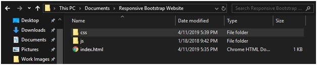
Remember that you will need to download Bootstrap into your development folder and extract it for the code to work correctly. By doing this, you will create two folders in your main development folder. It should look something like this:
The building process
All left to do from here is start the building process.
There are five major components for the responsive website:
- Navigation
- Information area
- Section with contents
- Right sidebar
- Footer
Let’s start with the first item,
Here’s a code example for creating the navigation bar:
     <nav class=”navbar fixed-top navbar-expand-md navbar-light bg-light”>
<a class=”navbar-brand” href=”#”>Responsive Bootstrap Website</a>
<button class=”navbar-toggler” type=”button” data-toggle=”collapse” data-target=”#navbarCollapse” aria-controls=”navbarCollapse” aria-expanded=”false” aria-label=”Toggle navigation”>
</button>
/* left navigation links */

<ul class=”navbar-nav mr-auto”>
/* active navigation link */

  <li class=”nav-item active”>
<a class=”nav-link” href=”#”>Home
(current)
</a>
</li>

/* regular navigation link */

  <li class=”nav-item”>
<a class=”nav-link” href=”#”>About</a>
</li>

/* more navigation links*/

  <li class=”nav-item”>
<a class=”nav-link” href=”#”>Blog</a>
</li>
</ul>

/* right navigation link */

<ul class=”nav navbar-nav ml-auto”>

  <li class=”nav-item”>
<a class=”nav-link” href=”#”>Login</a>
</li>


  <li class=”nav-item”>
<a class=”nav-link” href=”#”>Register</a>
</li>
</ul>

</nav>
Next, you need to get your information up, which is pretty easy, thanks to the jumbotron class. Also, don’t forget to use the div tag to keep things organised.
For the third step, we will need to create content using the col-md-* structure. Once done, we will prepare the right sidebar and finally make the footer that provides business information and other copyright details.
And that’s it: your basic responsive website is ready with Bootstrap.
Final Words
Mobile-friendly web design approach has become an absolute necessity for building a quality and successful website. Remember that you’re designing your website for users who have recently started using mobiles more than computers.
We hope this article helped you figure out the basics of responsive web design so that you can create more mobile-friendly websites from now on. And most importantly, we hope that a responsive website will help increase your webpage’s traffic and boost your conversion rates!
General FAQ
What are the advantages of responsive web design?
The main benefits of responsive web design are its flexibility, cost efficiency, wider reach, and better user experience. They also allow your webpage to be more SEO-friendly.
Is getting a responsive web design affordable?
It depends on which agency or designer you choose to trust your responsive web design. If the designer has a long and impressive experience, then it might get a little too costly. However, you can always find affordable solutions.
Is it possible to convert the existing website to a responsive one?
Yes, it is. You just need to get some advanced programs and designs to transform your current website into a more responsive one.
